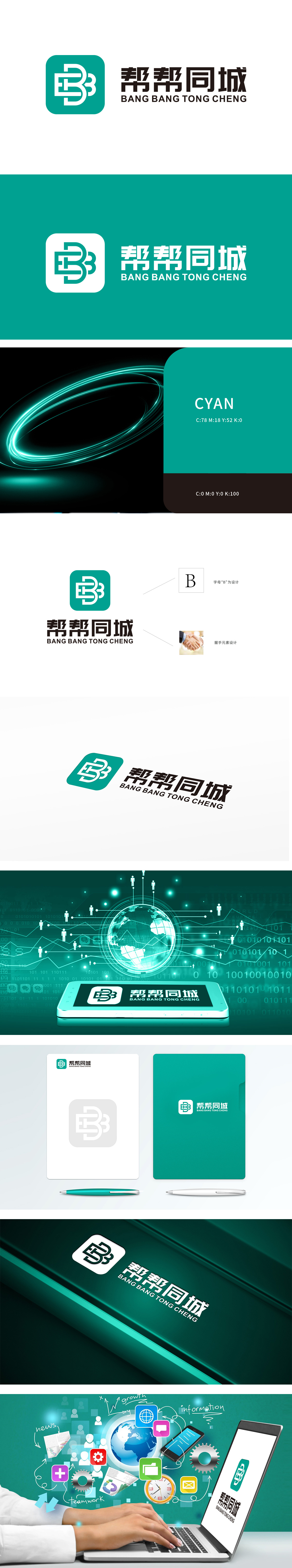
当绿色正方形与抽象“B”符号碰撞,狮动设计用极简美学重构品牌语言。帮帮同城LOGO以双“B”交织为核,暗藏“3”字隐喻,象征三方协作的生态链;握手元素的融入,将信任与连接具象化为视觉符号。这一设计不仅强化了品牌辨识度,更通过几何与意象的平衡,传递出“高效、可靠、共赢”的核心价值。
When the green square collides with the abstract "B" symbol, Lion Design reconstructs the brand language with minimalist aesthetics. Help the same city LOGO with double "B" interweaving as the core, hiding the metaphor of "3", symbolizing the ecological chain of tripartite cooperation; With the integration of handshake elements, trust and connection are visualized as visual symbols.


扫码或拨打添加客服微信


