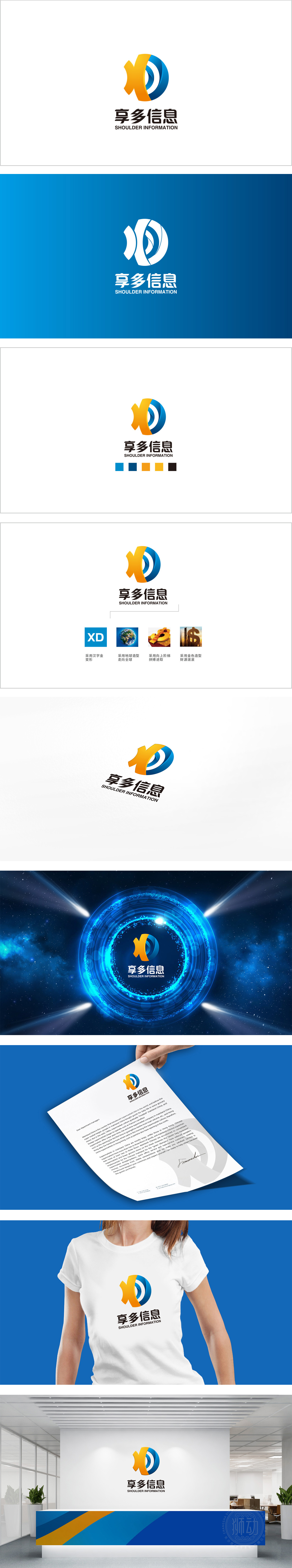
狮动设计采用字母变形+汉字意象”的组合方式,将品牌名称“享多”的进行抽象融合,似“包容的平台”或“全球的循环”)。两者缠绕叠加,既保留了字母的辨识度,又“信息传递”的流动属性。融入了金属质感的线条处理,既强化了“金”的富贵意象,又符合“信息科技”的现代感。整体以“品牌名称”为原点,通过“字母变形+具象符号”的组合,将“享多”的“分享、更多”核心诉求转化为可感知的视觉语言。同时,色彩与辅助图形的配合,既强化了“科技、专业”的行业属性,又传递了“国际化、进取、财富”的品牌价值观。
Lion design adopts the combination of letter deformation and Chinese character image, which makes the brand name "enjoy more" abstract and integrated, like "inclusive platform" or "global cycle"). Both of them are intertwined and superimposed, which not only retains the recognition of letters, but also keeps the flowing property of "information transmission". The line processing with metallic texture not only strengthens the rich image of "gold", but also conforms to the modern sense of "information technology".


扫码或拨打添加客服微信


