首页 >> 原创案例
  • 行业分类
    全部 日化/日用 鞋服配饰 食品/烟酒茶/商超 餐饮/酒店 农渔牧业 医疗服务 保健/养生 家政/安保/维修 家电/商用电器 家居/软装 地产/建材 金融/管理/HR 互联网 广告/印刷/媒体 中介/代理服务 教育/培训 娱乐/文化 珠宝/工艺礼品 旅游服务 化工/能源/环保 重工机械/科技 车辆/运输/汽配 活动/公益/政府 综合型企业
  • 设计分类
    全部 LOGO设计 吉祥物/卡通 包装设计 UI/WEB设计 宣传品 展厅/文化墙 室内设计 VIS/SI/全案
  • 庆隆镇人民政府 政府/公益组织 LOGO设计

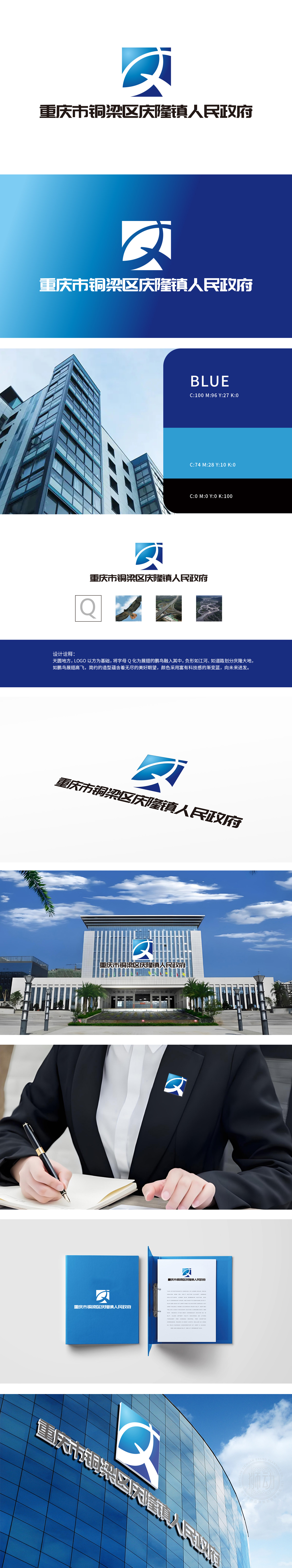
    狮动设计以方形为基础,结构稳定,象征政府的坚实与可靠。鹏鸟元素:字母Q化为展翅的鹏鸟,象征展翅高飞,寓意政府的发展与进取。负形如江河、道路,象征政府管辖区域的地理特征与交通网络。狮动设计以符号语言解构政务精神,为政府品牌注入视觉冲击力与文化深度。

    Lion design is based on square, with stable structure, which symbolizes the solidity and reliability of the government.Pengniao element: the letter Q turns into a Pengniao with wings spread, symbolizing soaring, implying the development and enterprising of the government. Negative forms, such as rivers and roads, symbolize the geographical characteristics and transportation network of the government-administered areas.


    庆隆镇人民政府 政府/公益组织 LOGO设计


    我想要类似的服务>>

    发表评论(176+)>>


    测试221124测试221124

    T:189 0730 1477

    www.shidong.co

    2016-2022 狮动®长沙思传品牌策划有限公司

    湘ICP备2022023572号-1

    咨询客服

    189 0730 1477

    扫码或拨打添加客服微信

    预约设计

    咨询客服 & 预约设计

    189 0730 1477

    扫码或拨打添加客服微信