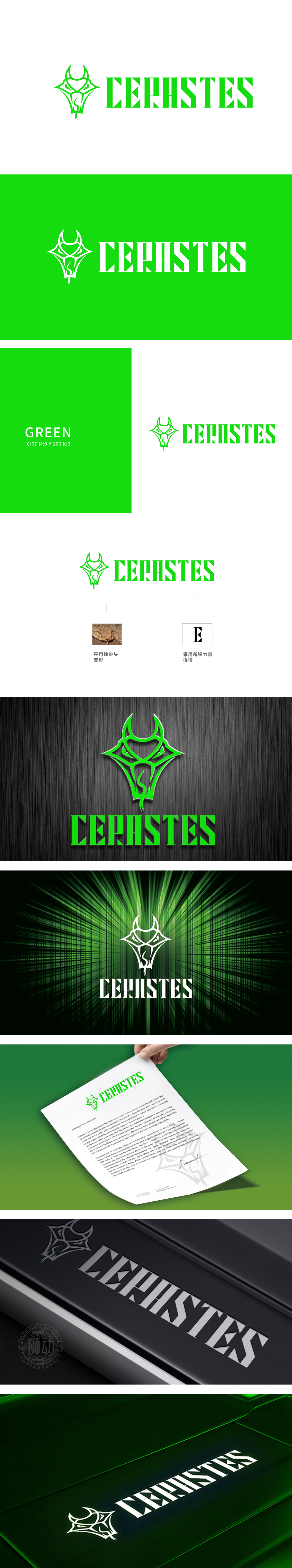
狮动设计通过汲取沙漠角蝰的锐利形态,以几何线条勾勒出蛇头轮廓,既保留生物的原始力量感,又通过抽象变形注入科技美学。蛇角与鳞甲的细节提炼,暗喻品牌在竞争中精准洞察、迅捷出击的生存智慧。字母"E"的解构重构:右侧"E"字型摒弃传统框架,以斜切笔画与缺口设计打破常规,象征突破边界、持续进化的科技理念。其刚毅的线条与图形部分形成视觉张力,强化品牌锐意进取的特质。选用高饱和度绿色为主色调,既呼应自然生态的蓬勃生命力,亦暗喻科技领域的可持续发展。色彩与图形的碰撞,构建出兼具野性与理性的品牌认知。
The lion movement design draws on the sharp shape of the desert horned beetle, and outlines the outline of the snake head with geometric lines, which not only retains the original sense of strength of creatures, but also injects scientific aesthetics through abstract deformation. The refinement of the details of the snake horn and scales is a metaphor for the brand's survival wisdom of accurate insight and quick attack in the competition. Deconstruction and reconstruction of the letter "e": The "e" on the right side abandons the traditional framework, breaks the convention with oblique strokes and notch design, and symbolizes the scientific and technological concept of breaking through the boundary and continuously evolving.


扫码或拨打添加客服微信


