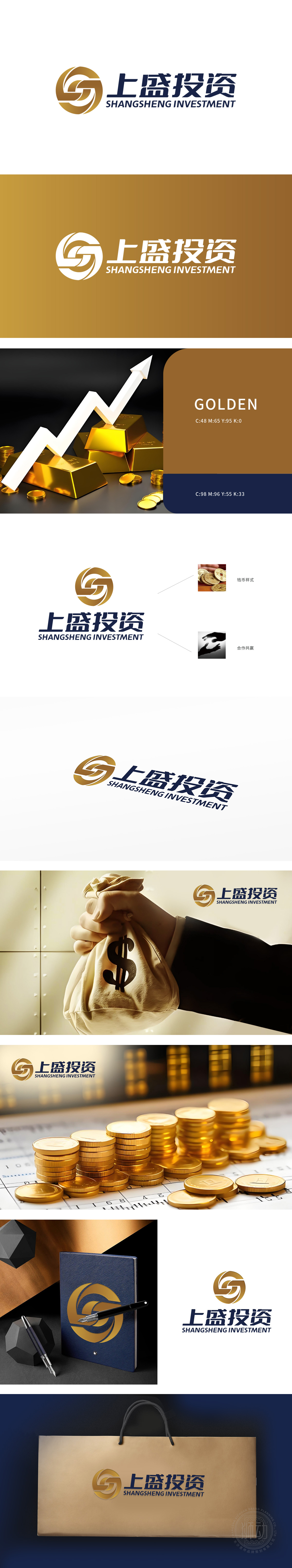
狮动设计以金色“S”与“G”交织为核心,形成稳定而动态的视觉符号。金色象征财富、高端与信赖,契合金融行业的专业形象;交织结构暗喻资本流动与稳健增长,传递“创新与稳健并行”的核心理念。字体采用简洁有力的无衬线字体,强化现代感与权威感,符合金融品牌对“专业性”的视觉诉求。钱币样式图标:古钱币图案与现代金融元素结合,既彰显传统财富文化,又暗喻投资增值的连续性,强化“财富积累与传承”的品牌承诺。
Lion design takes the interweaving of gold "S" and "G" as the core, forming a stable and dynamic visual symbol. Gold symbolizes wealth, high-end and trust, which fits the professional image of the financial industry; Interleaved structure is a metaphor for capital flow and steady growth, and conveys the core idea of "innovation and steady parallel". The font is simple and powerful sans serif font, which strengthens the sense of modernity and authority and conforms to the visual appeal of financial brands for "professionalism".


扫码或拨打添加客服微信


