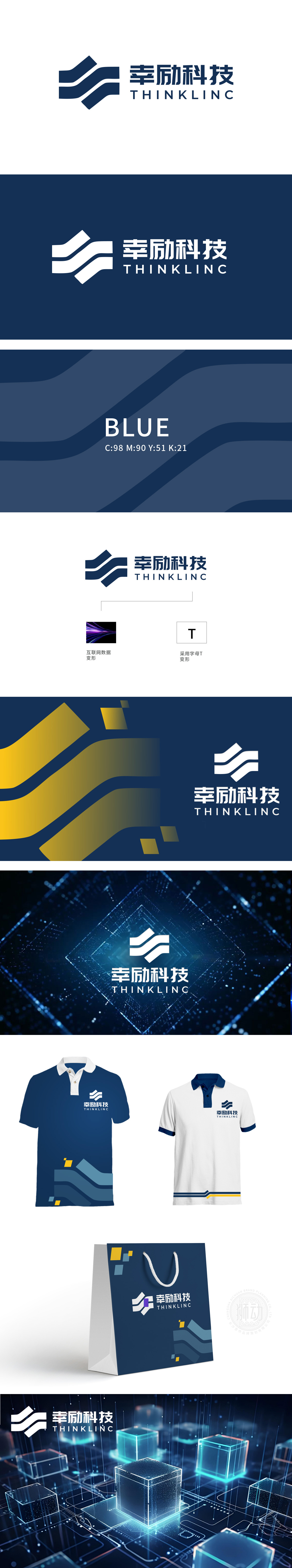
狮动设计采用字母变形:“T”形符号由线条演变,呼应“科技”(Tech)首字母,强化品牌记忆点。深蓝色传递专业、可靠感,符合科技企业形象,同时暗喻数据安全与技术深度。狮动设计通过抽象符号与行业符号结合,将“幸励科技”定位为以数据驱动、创新技术为核心竞争力的企业,符合互联网与软件行业对“高效、智能、可靠”的品牌诉求。
Lion design adopts letter deformation: the T-shaped symbol evolves from lines, echoing the initials of "Tech" and strengthening the brand memory. Dark blue conveys a sense of professionalism and reliability, conforms to the image of a technology enterprise, and is a metaphor for data security and technical depth.


扫码或拨打添加客服微信


