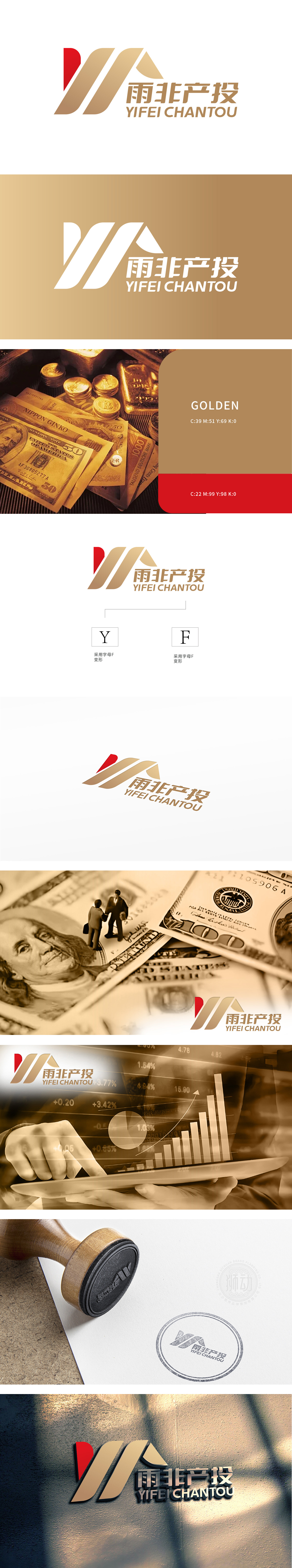
狮动设计将字母Y与F解构重组,形成锋利的“破界”结构。红金配色直击金融行业“财富动能”与“稳健价值”的核心诉求,通过简约的现代设计语言,构建出品牌独有的“视觉锤效应”。Logo采用金色和红色为主色调。金色象征着财富、高端与专业,红色则代表着热情、活力与创新。这两种颜色的结合,既体现了金融行业的稳重与可靠,又展现了公司的活力与进取精神。
Lion design deconstructs and recombines the letters Y and F to form a sharp "boundary-breaking" structure. The color matching of red gold directly hits the core demands of "wealth kinetic energy" and "steady value" in the financial industry, and constructs the brand's unique "visual hammer effect" through simple modern design language. Logo uses gold and red as the main colors. Gold symbolizes wealth, high-end and professionalism, while red represents enthusiasm, vitality and innovation.


扫码或拨打添加客服微信


