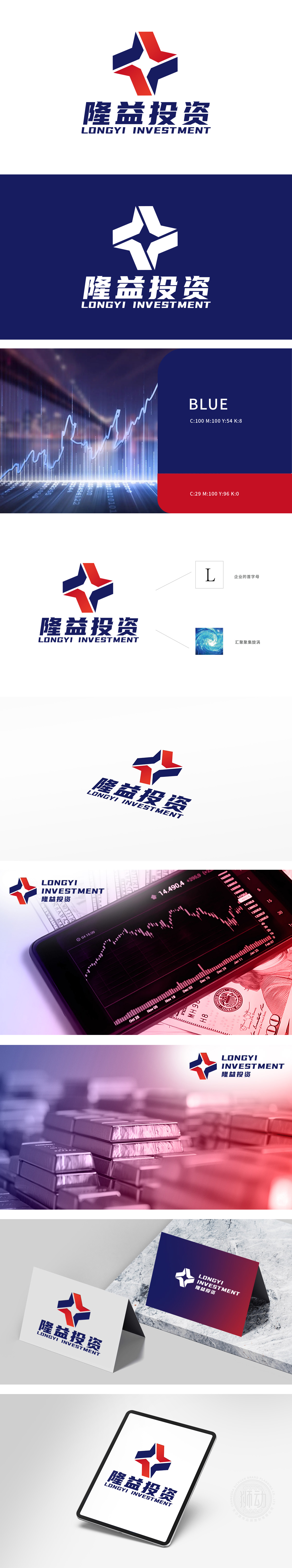
狮动设计采用首字母“L变形,融入抽象的几何图形设计,整体形状星形,象征着动感、活力和方向性。寓意着资金的流动性和投资的多元性。象征着资金的汇聚和投资的聚集效应,体现了金融投资中资源整合和资本运作的概念。红蓝渐变象征风险与机遇的动态平衡。呈现出一个极具辨识度与感染力的品牌标识,充分展现其非凡的设计实力。
Lion design uses the first letter "L" deformation, integrated with abstract geometric design, and the overall shape is star-shaped, symbolizing movement, vitality and directionality. It means the liquidity of funds and the diversity of investment. It symbolizes the aggregation effect of capital and investment, and embodies the concepts of resource integration and capital operation in financial investment. The gradual change of red and blue symbolizes the dynamic balance between risk and opportunity. It presents a highly recognizable and infectious brand logo, fully demonstrating its extraordinary design strength.


扫码或拨打添加客服微信


