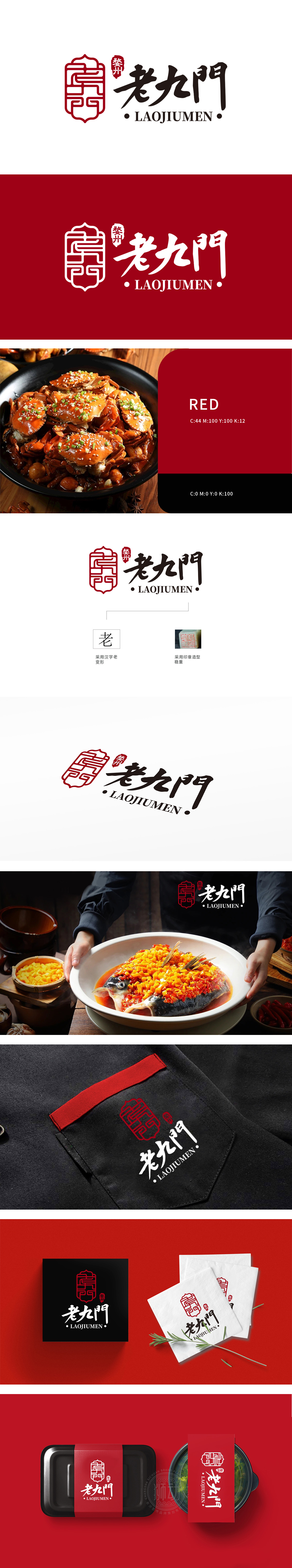
狮动设计为“门”字与“九”字的抽象融合变形(或“九宫格”“门户”意象),线条交错如传统窗棂或门饰,暗合“九门”的名称含义,同时传递“开门迎客”“美食之门”的餐饮属性。兼具力量感与人文气息,体现品牌的匠心与历史沉淀。正红色(中国传统吉祥色)为主色调,象征热情、喜庆与正宗,视觉冲击力强,易引发食欲与信任感,符合餐饮行业的色彩心理学应用。整体设计以中式传统美学为核心,融合印章、书法与地域文化元素,传递出餐饮品牌的历史感、正宗性与文化底蕴,符合“老九门”这一名称自带的复古与经典联想,强化地方特色餐饮的定位。
Lion is designed as an abstract fusion of the word "door" and the word "nine" (or the image of "nine squares" and "portal"). The lines are staggered like traditional window sills or door decorations, which coincides with the name meaning of "nine doors" and conveys the catering attributes of "opening the door to welcome guests" and "the door of food". It has a sense of strength and humanistic atmosphere, reflecting the ingenuity and historical precipitation of the brand. True red (the traditional auspicious color in China) is the main color, symbolizing enthusiasm, celebration and authenticity, with strong visual impact, which is easy to arouse appetite and trust, and conforms to the application of color psychology in catering industry.


扫码或拨打添加客服微信


