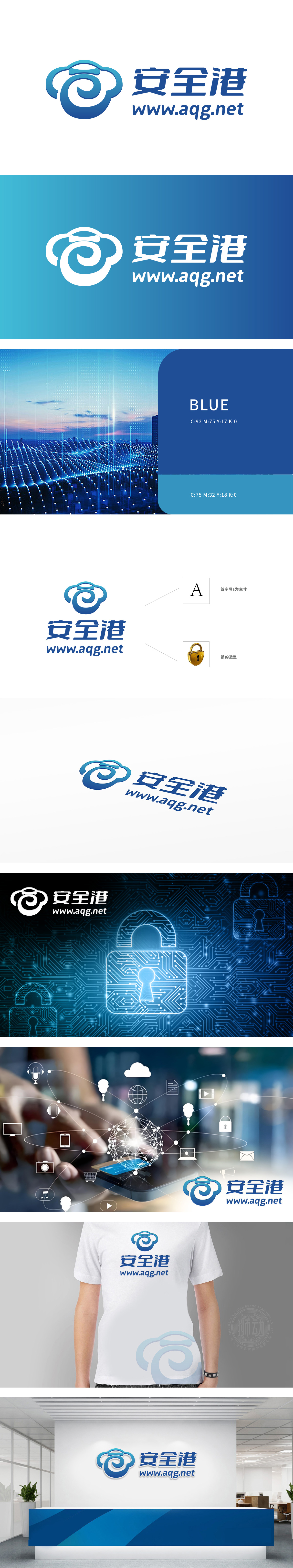
狮动设计以品牌名称首字母"A"为骨架,巧妙融合「云」的流动弧线与「锁」的精密结构——顶部云朵造型传递守护与包容感,中部环形线条自然勾勒出锁孔轮廓,将"安全"的核心属性融入符号基因,极简线条却让科技感与信任感跃然眼前。主色调采用深海蓝,沉稳中透着专业,既呼应科技行业的冷静调性,又强化"安全港"可信赖的品牌联想;字体设计方正有力,与图形的柔和弧线形成平衡,整体传递"科技守护安全"的双重价值。
Lion design takes the initial "a" of the brand name as the skeleton, and skillfully blends the flowing arc of "cloud" with the precise structure of "lock"-the top cloud shape conveys the sense of protection and tolerance, and the circular line in the middle naturally outlines the outline of the keyhole, blending the core attribute of "safety" into the symbol gene, while the minimalist line makes the sense of science and technology and trust jump to the fore. The main color is deep blue, which is calm and professional, not only echoing the calm tonality of the technology industry, but also strengthening the reliable brand association of "safe harbor";


扫码或拨打添加客服微信


