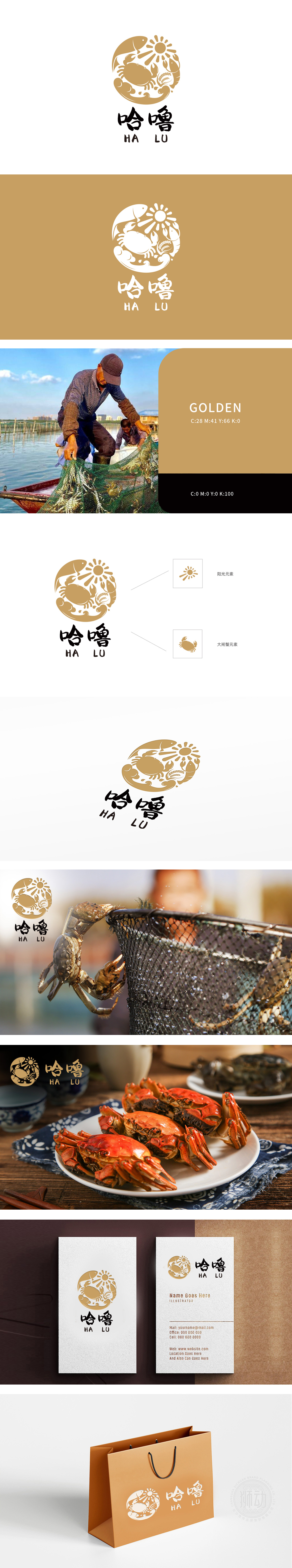
狮动设计以饱满的圆形为基底,将生鲜食材与自然元素巧妙融合,传递“食材新鲜、品类丰富、用餐圆满”的品牌理念。暖金色调(类似蟹壳、麦穗的自然色泽)则赋予品牌温暖、亲切的质感,打破传统生鲜品牌的“冷感”印象。 大闸蟹元素(主视觉焦点):以线条勾勒的大闸蟹占据中心位置,螯足舒展,细节清晰,直接点明品牌核心品类优势,强化“生鲜水产”的专业属性;:环绕蟹身的鱼、虾剪影,暗示多品类生鲜组合,传递“一站式鲜活食材”的丰富度;顶部放射状阳光象征“自然生长、阳光滋养”,底部麦穗呼应“土地与丰收”,将“从产地到餐桌”的新鲜链路可视化; 水波纹与祥云:底部流动的水波纹既代表水产食材的生长环境,又以祥云形态增添中式美学韵味,适配餐饮场景的文化氛围感。为你定制看得见“新鲜”与“温度”的视觉符号!
Lion dance design takes graphic narration as the core, and uses a circular LOGO to condense the ecological aesthetics and taste association of fresh food and beverage. Based on a full circle, fresh ingredients are skillfully integrated with natural elements to convey the brand concept of "fresh ingredients, rich categories and complete meals". Warm golden tones (similar to the natural colors of crab shells and wheat ears) give the brand a warm and intimate texture, breaking the "cold feeling" impression of traditional fresh brands. Hairy crab element (main visual focus): Hairy crabs outlined by lines occupy the central position, with stretched claws and clear details, directly pointing out the advantages of brand core categories and strengthening the professional attributes of "fresh aquatic products";


扫码或拨打添加客服微信


