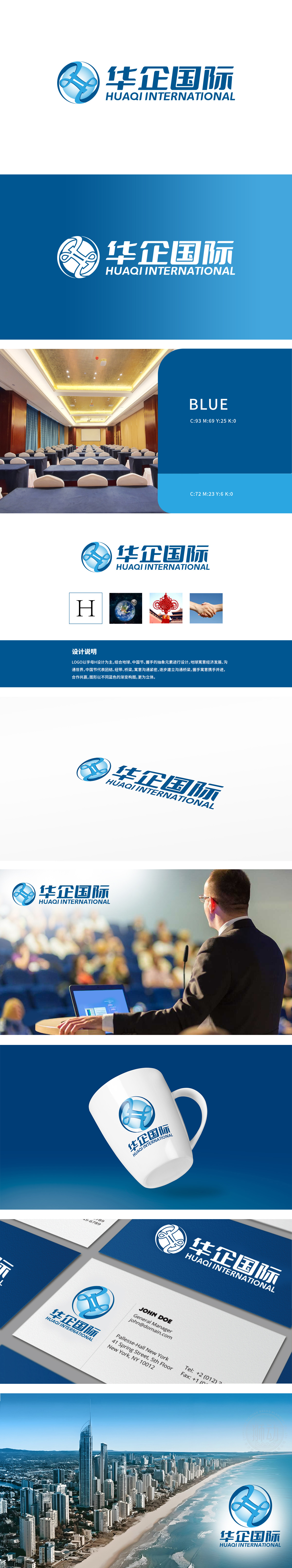
狮动设计以字母“H”为主体,抽象融合地球(全球化)、中国结(文化与纽带)、握手(合作)三大核心意象,兼具国际视野与本土文化底蕴。色彩与质感:采用不同蓝色渐变,增强图形立体感与科技感,蓝色同时传递专业、可靠、沉稳的品牌调性。通过视觉符号系统,集中展现“沟通紧密、合作共赢、逐步构建全球桥梁”的企业发展理念。
Lion design takes the letter "H" as the main body, and abstractly integrates the three core images of the earth (globalization), Chinese knot (culture and ties) and handshake (cooperation), which has both international vision and local cultural heritage. Color and texture: adopt different blue gradients to enhance the three-dimensional sense of graphics and technology, and blue conveys professional, reliable and calm brand tonality at the same time.


扫码或拨打添加客服微信


