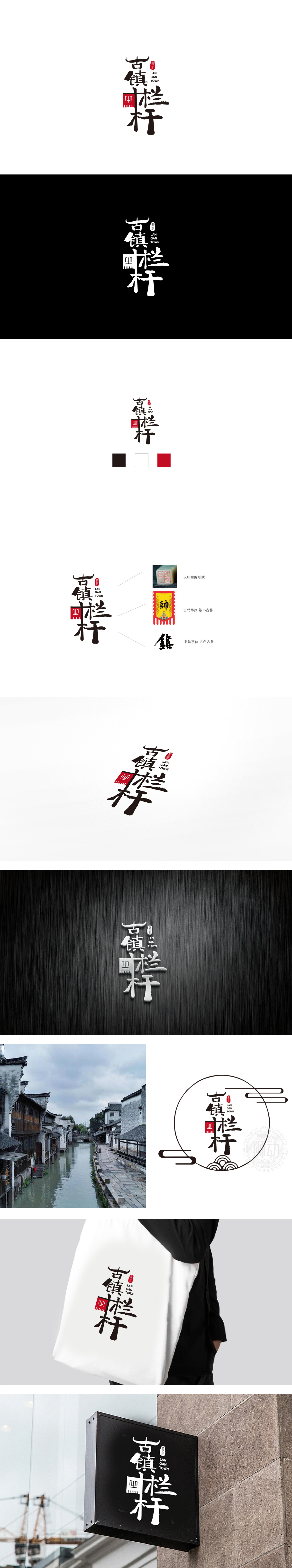
狮动设计采用手写书法字体,“古”字的上半部分如“屋顶”,“镇”字的“金”旁简化为类似“建筑”的轮廓,“栏”“杆”二字的竖笔加粗、撇捺舒展,既有中国传统书法的苍劲感,又通过笔触的粗细变化营造出“栏杆”的木质纹理与结构感。红色作为中国传统色彩,不仅提升了LOGO的视觉冲击力,更传递出“热闹、喜庆、传统”的情绪,符合古镇的消费场景。整体通过字体隐喻(“古”=屋顶、“镇”=建筑)、符号简化(红色方形=栏杆结构)、色彩联想(红=传统、黑=厚重),将“古镇”的“文化底蕴”与“栏杆”的“功能记忆”深度融合。用最简单的元素,讲最清楚的故事。
Lion design adopts handwritten calligraphy font, and the upper part of the word "ancient" such as "roof" and "town" is simplified to be similar to the outline of "architecture", while the vertical strokes of "column" and "pole" are bold and stretched, which not only has the vigor of China traditional calligraphy, but also creates the wooden texture and structure of "railing" through the thickness change of strokes. As a traditional Chinese color, red not only enhances the visual impact of LOGO, but also conveys the mood of "lively, festive and traditional", which is in line with the consumption scene of the ancient town.


扫码或拨打添加客服微信


