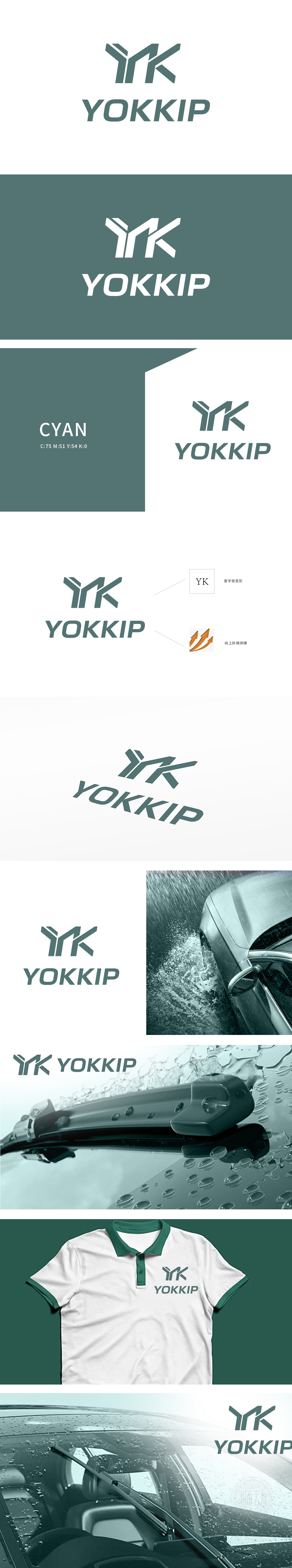
狮动设计基于品牌名称首字母“YK”为设计基础,采用绿色线条进行抽象化变形:字母融合:“Y”与“K”通过流畅的线条连接,结构紧凑且富有力量感,体现品牌的一体化形象与专业性。动态笔触:线条末端带有轻微倾斜和延伸感,暗合“向上阶梯拼搏”的辅助图形理念,传递积极进取的品牌精神 ,通过 “无衬线工业风+机械感线条+低重心结构+功能性色彩” 的组合,精准匹配汽车及零部件行业的核心气质——既体现“ 精密、耐用、稳定 特定性"。
Lion Movement team conducted in-depth research on the industry trends and brand concepts, with vibrant orange as the main color, created an embarrassing cartoon bear image, and held a spoon to convey the pleasure of dining. Innovative use of "auspicious | food | bear" separate design, with pinyin to strengthen recognition. Simple and bright visual language fits the light food track accurately, and customers are full of praise for the design ability of Lion Motion's "strategy+creativity" dual drive, calling "this is the soul of our new brand"!


扫码或拨打添加客服微信


