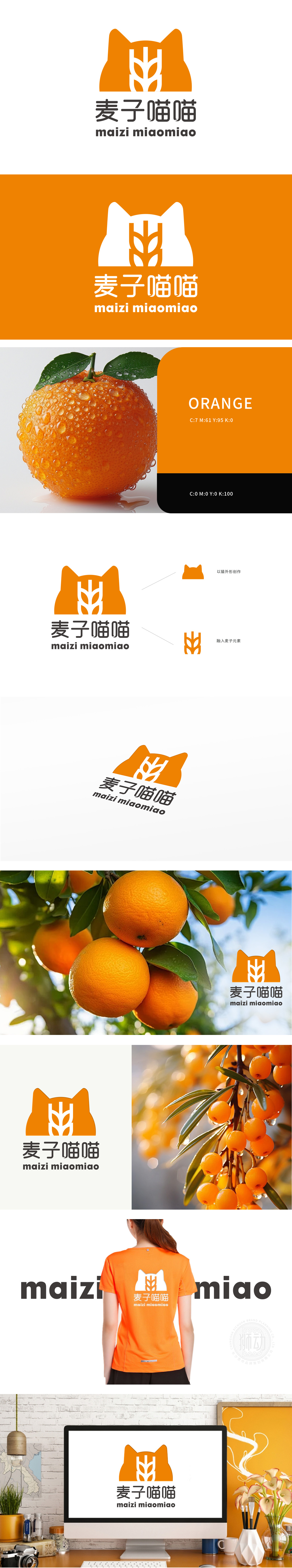
狮动设计以饱满的橙色猫头部轮廓为核心,圆润的线条勾勒出立耳、弧形面部的经典猫形象,自带亲和力与“喵喵”的名称联想,迅速拉近与消费者的情感距离,麦子元素”图标线条简洁且富有生长感,,强化品牌与“自然、健康”的关联。主色调采用温暖的橙色,既呼应“麦子”的成熟色与食物的食欲感,又通过明亮的色彩传递活力、阳光的品牌性格;成功塑造了一个既有行业辨识度(麦子)又有情感连接点(猫/萌感)的LOGO。将抽象科技与具象农业科技元素无缝衔接,用色彩与符号构建差异化视觉体系。
Lion design takes the full orange cat head outline as the core, and the rounded lines outline the classic cat image with erect ears and curved face. It has affinity and the name association of "Meow Meow", which quickly narrows the emotional distance with consumers. The lines of "Wheat Element" icon are simple and rich in growth, which strengthens the relationship between the brand and "nature and health". The main color is warm orange, which not only echoes the mature color of "wheat" and the appetite of food, but also conveys the brand character of vitality and sunshine through bright colors.


扫码或拨打添加客服微信


