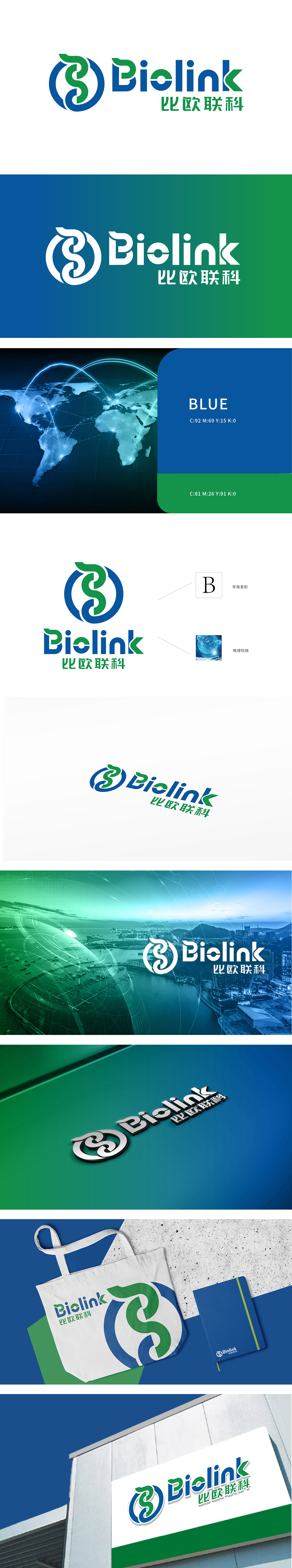
狮动设计以字母“B”为原型,通过流畅的蓝绿双螺旋线条构建出循环环绕的结构。蓝色象征科技的理性与专业,绿色传递生命科学或可持续发展的理念,双螺旋既呼应了“Link”的连接属性,又暗合科技领域中数据链、基因链的意象,环形设计则强化了闭环协作、全球化的视觉感受,通过“字母变形(B)+ 行业符号(双螺旋、地球)+ 色彩隐喻(科技蓝+生态绿)”的三重设计语言,不仅让Logo具备现代美感,更传递出“连接科技与生命/生态”的深层品牌价值。
Lion design takes the letter "B" as the prototype, and constructs a circular structure through smooth blue-green double helix lines. Blue symbolizes the rationality and specialty of science and technology, and green conveys the concept of life science or sustainable development. The double helix not only echoes the connection attribute of "Link", but also coincides with the images of data chain and gene chain in the field of science and technology. The circular design strengthens the visual feeling of closed-loop cooperation and globalization, and adopts the triple design of "letter deformation (B)+ industry symbol (double helix, earth)+color metaphor (technology blue+ecological green)".


扫码或拨打添加客服微信


