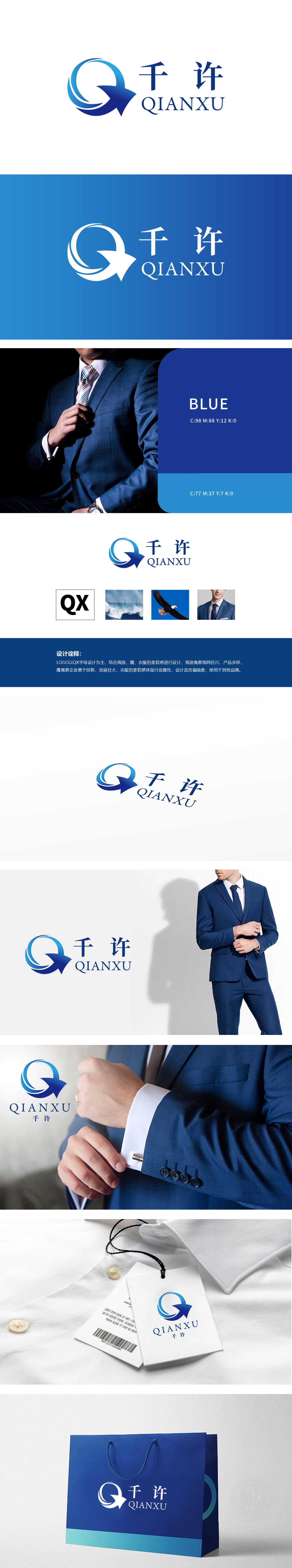
狮动设计以品牌名称首字母“QX”为核心,左侧“Q”字母通过流畅的蓝色曲线演绎,右侧“X”巧妙变形为箭头形态,整体形成环绕与延伸的视觉张力,传递动态与进取感。曲线线条模拟“衣服的柔软感”,贴合服装行业的材质特性,同时通过抽象化处理避免具象化服饰元素,增强LOGO的通用性。通过海浪、雄鹰、柔线等元素的意象化融合,既精准传递了服装品牌的行业特性,又赋予企业创新、多元的品牌气质。
Lion design takes the initial letter "QX" of the brand name as the core, the letter "Q" on the left side is interpreted through a smooth blue curve, and the "X" on the right side is cleverly deformed into an arrow shape, forming a surrounding and extending visual tension as a whole, conveying a sense of dynamic and enterprising. Curves and lines simulate the "softness of clothes" and fit the material characteristics of the clothing industry. At the same time, through abstraction, the figurative clothing elements are avoided and the universality of LOGO is enhanced. Through the imagery fusion of elements such as waves, eagles and soft threads.


扫码或拨打添加客服微信


