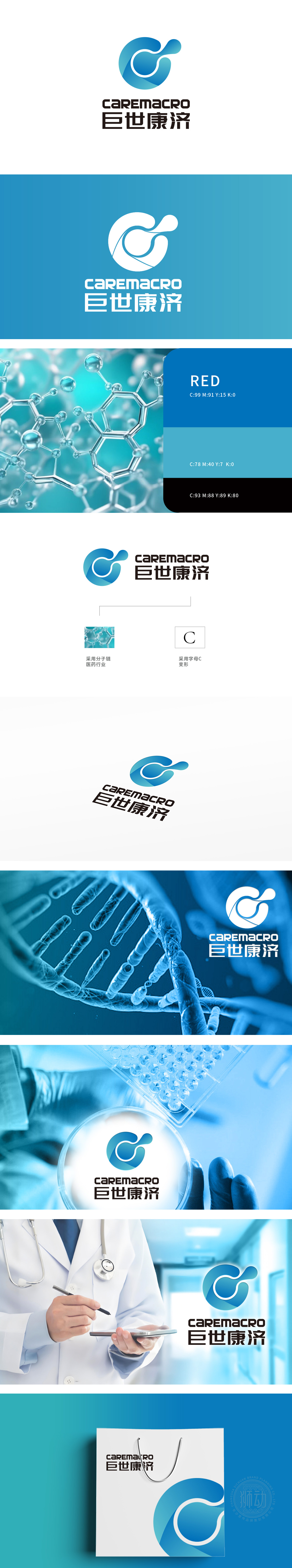
狮动设计以分子链结构为灵感(结合备注“采用分子链 医药行业”),通过流畅的蓝色曲线勾勒出类似DNA双螺旋或药物分子的形态,直观关联医疗、医药行业的科学性与专业性。图形中融入字母“C”的变形设计,也象征“Care(关怀)”与“Circle(循环/完整)”,传递医疗服务的核心价值——守护健康、循环赋能。主色调采用渐变蓝色,蓝色在医疗领域常与“信任、专业、冷静”相关联,符合医疗服务行业对严谨与创新的双重需求。寓意品牌以“全方位、宏观视角的健康关怀”为理念。
Inspired by the molecular chain structure (combined with the remark "using molecular chain medicine industry"), Lion Motion design outlines the shape similar to DNA double helix or drug molecules through a smooth blue curve, which intuitively relates the scientificity and professionalism of medical and pharmaceutical industries. The deformed design with the letter "C" in the graph also symbolizes "Care" and "Circle", which conveys the core values of medical services-protecting health and circular empowerment. The main color is gradient blue, and blue is often associated with "trust, professionalism and calmness" in the medical field.


扫码或拨打添加客服微信


