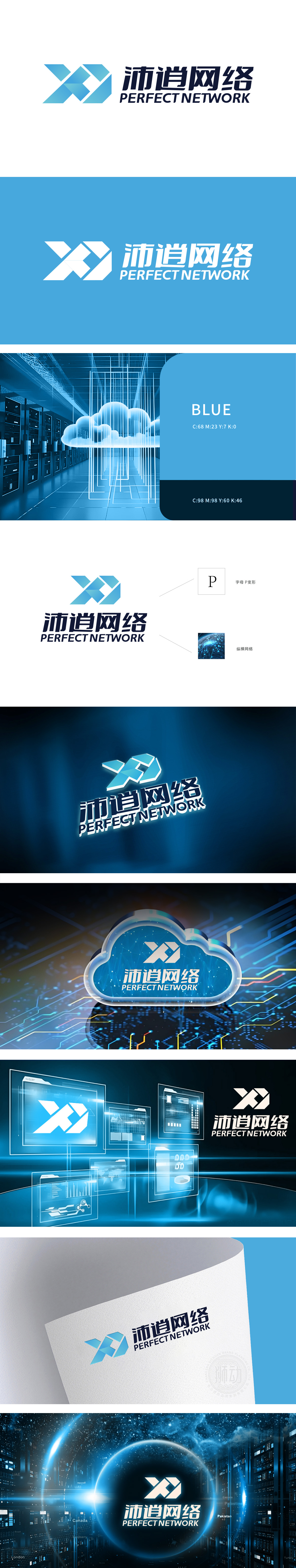
狮动设计以字母“P”为原型,采用对称的折线切割与立体堆叠,形成动态的“X”交叉结构,又通过交叉造型传递“连接、交互”的互联网特性。中文“沛逍网络”:采用粗体无衬线字体,笔画硬朗,结构紧凑,传递稳重可靠的品牌形象;“沛”“逍”二字兼具力量感与延伸感,隐喻网络的广阔覆盖与活力。选用渐变蓝色系,蓝色在行业中常象征科技、专业与信任,贴合网络科技公司的品牌定位;色块的明暗对比增强了图形的层次感与现代感。通过几何拼接、网络符号、科技蓝等元素,清晰传递互联网/科技行业的核心特征全球互联、数据交互。
Lion Motion Design takes the letter "P" as the prototype, adopts symmetrical folding lines and three-dimensional stacking to form a dynamic "X" cross structure, and conveys the Internet characteristics of "connection and interaction" through cross modeling. Chinese "Pei Xiao Network": bold sans serif font, tough strokes, compact structure, conveying a stable and reliable brand image; The words "Pei" and "Xiao" have both a sense of strength and extension, which symbolizes the broad coverage and vitality of the network. Choose gradient blue system, which often symbolizes technology, professionalism and trust in the industry, and fits the brand positioning of network technology companies; The contrast between light and shade of color blocks enhances the layering and modernity of graphics.


扫码或拨打添加客服微信


