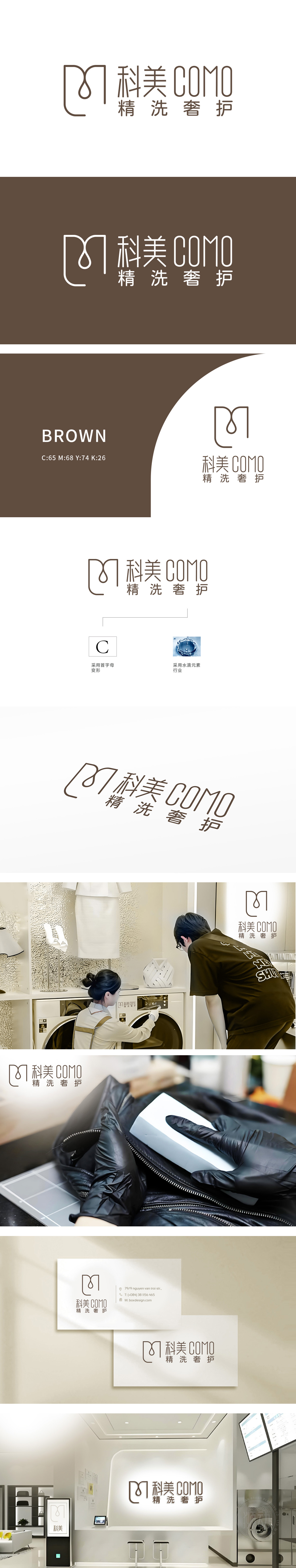
狮动设计以品牌英文“COMO”的首字母“C”为原型进行艺术化变形:外轮廓为流畅的圆角矩形与曲线组合,内部嵌入一滴抽象化的“水滴”元素(线条简约,形似滴落的水珠),既呼应“C”的字母形态,又直观关联“洗护”行业的核心——水,水滴的晶莹感象征清洁、纯净,动态的滴落形态则暗示洗护过程的流动性与专业性,增强消费者对“精洗”服务的联想。形成“品牌标识+行业符号”的双重记忆点。图形整体线条纤细、弧度柔和,传递出精致、细腻的服务感受。
Lion Motion Design takes the initial letter "C" of the brand English "COMO" as the prototype for artistic transformation: the outer contour is a combination of smooth rounded rectangles and curves, and an abstract "water drop" element (simple lines, like dripping water drops) is embedded inside, which not only echoes the letter form of "C", but also intuitively relates to the core of the "care" industry-water, and the crystal sense of water drops symbolizes cleanliness and purity. Form a dual memory point of "brand identity+industry symbol". The overall lines of the graphics are slender and the radian is soft, conveying a delicate and delicate service feeling.


扫码或拨打添加客服微信


