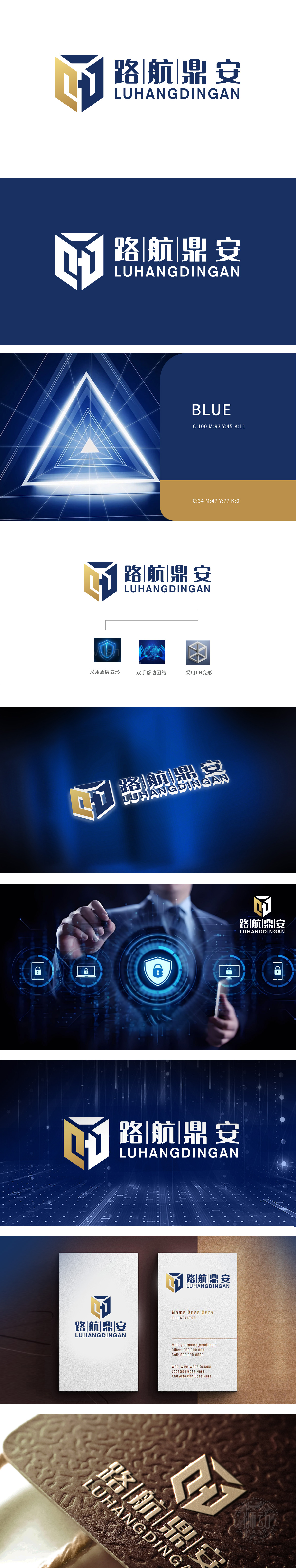
狮动设计通过蓝色立体六边形(类盾牌轮廓),内嵌金色“LH”变形字母,形成“外盾内撑”的视觉结构。六边形作为稳定几何图形,象征“坚固防护”;金色线条穿插其中,既强化“LH”品牌专属识别,又通过棱角切割体现科技感与精密性。金色:提升品牌质感,象征价值与引领,与“鼎安”(鼎立安全)的寓意形成呼应,以“安全为基、科技为翼”为核心,通过结构化图形、精准色彩与行业符号的有机融合,既满足互联网安全领域对专业性、可靠性的视觉需求,又以创新设计语言塑造差异化品牌形象。
Lion design is a blue solid hexagon (shield-like outline), embedded with gold "LH" deformation letters, forming a visual structure of "outer shield and inner support". As a stable geometric figure, hexagon symbolizes "solid protection"; Gold lines are interspersed among them, which not only strengthens the exclusive identification of "LH" brand, but also reflects the sense of science and technology and precision through angular cutting. Gold: enhancing brand texture, symbolizing value and leading, echoing the meaning of "Ding 'an" (Dingli Security), taking "safety as the foundation and technology as the wing" as the core, through the organic integration of structured graphics, accurate colors and industry symbols.


扫码或拨打添加客服微信


