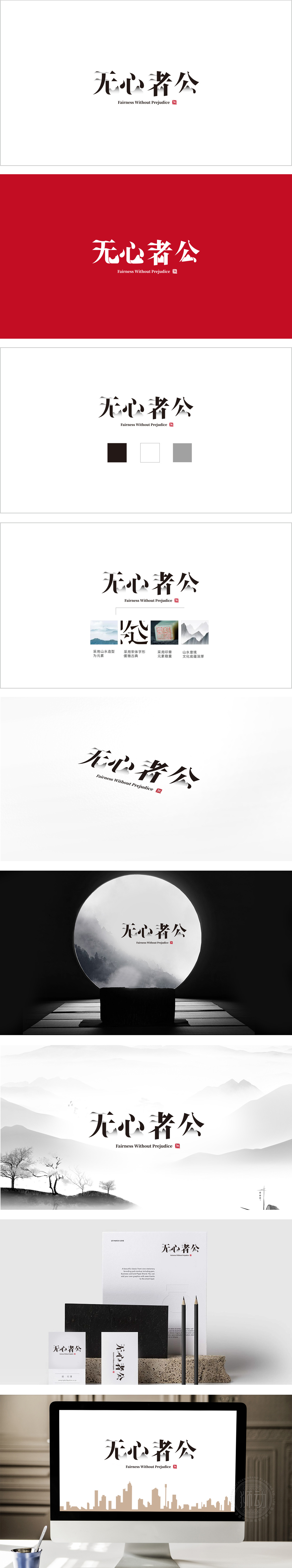
狮动设计采用汉字的“图形化解构”,“无”字的撇画被处理为层叠的山峰,“心”字的点画简化为流动的云/水滴,“者”字的竖画似挺拔的立柱,“公”字的撇捺像展翼的飞鸟,这种手法,实则是对“汉字是象形文字”的本质回归,却用现代设计语言重构了传统。黑白主色调符合中式“大道至简”的美学,红章“無”(同“无”)借鉴传统篆刻,既强化了“无偏见”的核心主题,又用红色打破单调,成为视觉焦点山峰、云、飞鸟等自然元素的融入,将“无心者公”的抽象哲理转化为宁静、豁达的意境,符合中式“天人合一”的文化内核。这种“以形载意”的设计逻辑,用视觉语言“讲好文化故事”。
Lion design adopts the "graphic deconstruction" of Chinese characters, and the sketch of "nothing" is treated as a layered mountain peak, while the stippling of "heart" is simplified as a flowing cloud/water drop, while the vertical painting of "zhe" is like a tall and straight column, and the skimming of "gong" is like a bird spreading its wings. This technique is actually a return to the essence of "Chinese characters are hieroglyphics", but it reconstructs the tradition with modern design language. The main color of black and white conforms to the aesthetics of Chinese style "Avenue to Simplicity", while the red chapter "Wu" (the same as "Wu") draws lessons from traditional seal cutting, which not only strengthens the core theme of "unbiased".


扫码或拨打添加客服微信


