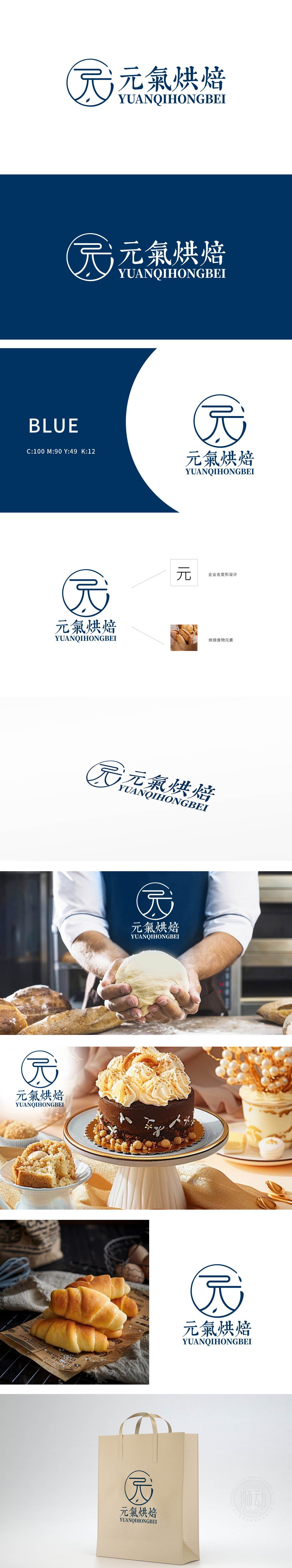
狮动设计基于“元”字为核心进行变形设计,线条流畅且呈环形包裹结构,环形可联想为烘焙常用的“烤盘”“圆形模具”,或象征烘焙产品的完整、团圆感。线条末端的点状装饰,隐喻烘焙原料增加细节与行业关联性。整体将“元气烘焙”中的“元”字作为设计核心,实现品牌名、行业属性、视觉符号的三重统一,强化品牌识别度。
Lion Design is designed with the word "Yuan" as the core, with smooth lines and a ring-shaped package structure. The ring shape can be associated with the "baking tray" and "circular mold" commonly used in baking, or it symbolizes the integrity and reunion of baked products. The dotted decoration at the end of the line means that baking materials increase the relevance of details and industries.


扫码或拨打添加客服微信


