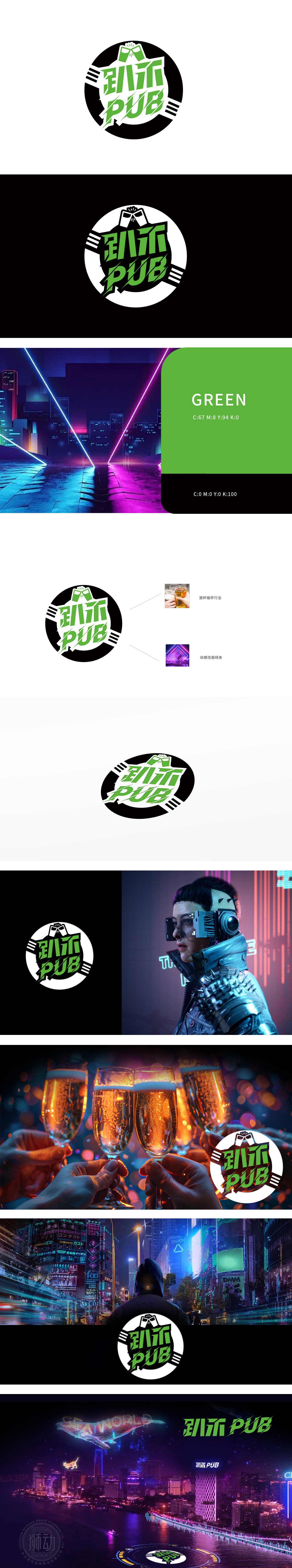
狮动设计通过LOGO顶部的绿色图形为两只相碰的酒杯剪影,直接呼应“酒吧”场景中举杯欢庆的社交属性,强化了行业识别度。情感传递:通过碰杯动作传递出热闹、互动的氛围,符合酒吧作为社交空间的定位。中文“趴乐”:“趴”(派对、聚会)+“乐”(快乐),口语化表达贴近年轻消费群体,传递轻松、愉悦的品牌调性;字体采用倾斜切割设计,增强动感与活力。圆形边缘的白色放射状线条,模拟灯光或音符的律动感,与“动感炫丽线条”的标注呼应,暗合酒吧夜生活的热闹与节奏感。
Lion Design silhouettes two colliding wine glasses through the green graphic at the top of the LOGO, which directly echoes the social attribute of raise your glass in the "bar" scene and strengthens the industry recognition. Emotional transmission: It conveys a lively and interactive atmosphere through clinking glasses, which is in line with the positioning of the bar as a social space.The font is designed with oblique cutting to enhance the sense of movement and vitality. The white radial lines on the circular edge simulate the rhythm of lights or notes.


扫码或拨打添加客服微信


