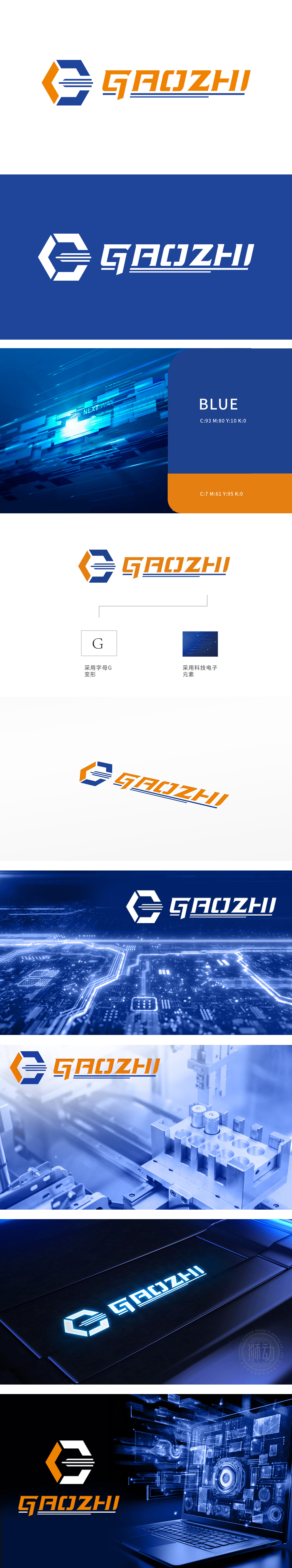
狮动设计以字母“G”为原型进行变形设计,融合科技电子元素,形成兼具识别性与行业属性的视觉符号。图形由蓝色和橙色六边形拼接构成,六边形象征稳定、科技感与精密性,符合电子/科技行业特质。内部嵌入三条平行线条,类似“电流”或“信号传输”的抽象表达,强化动态与科技属性,与右侧“科技电子元素”备注呼应。蓝橙对比色搭配:蓝色代表专业、可靠,橙色传递活力、创新,色彩鲜明且具有记忆点。将“字母G”的品牌基因与“科技电子”的行业属性巧妙结合,打造出兼具美感与功能性的LOGO视觉系统。
Lion design takes the letter "G" as the prototype for deformation design, and integrates scientific and technological electronic elements to form a visual symbol with both recognition and industry attributes. The graphics are composed of blue and orange hexagons, which are characterized by stability, sense of science and technology and precision, and conform to the characteristics of electronics/science and technology industry. Three parallel lines are embedded inside, which are similar to the abstract expression of "current" or "signal transmission", strengthening the dynamic and scientific attributes, echoing the remarks of "scientific and technological electronic elements" on the right.


扫码或拨打添加客服微信


