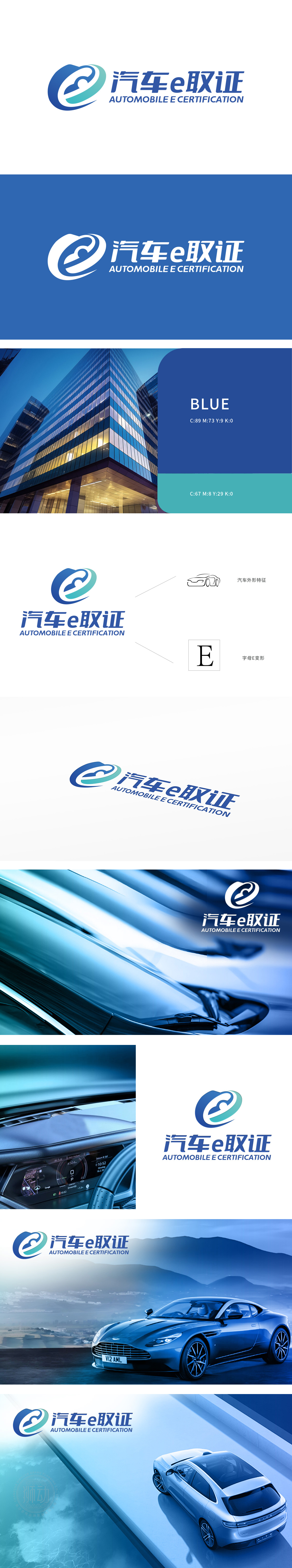
汽车e取证品牌委托狮动设计logo,狮动精准捕捉其“科技+交通”的行业特性,以创意融合打造视觉符号。Logo左侧将“e”变形为旋转汇聚的流线图形,象征高效取证与数据互联;蓝色与浅绿渐变传递专业、可靠的品牌气质。右侧中英文搭配强化国际视野,字体设计简洁有力,整体在白色背景上形成鲜明焦点。狮动从品牌核心价值出发,将抽象概念转化为极具辨识度的视觉语言,助力汽车e取证在市场中脱颖而出。
Automobile e-forensics brand entrusts Lion Motion to design logo, which accurately captures its industry characteristics of "technology+transportation" and creates visual symbols through creative integration. On the left side of the Logo, the "E" is transformed into a streamlined figure with rotating convergence, symbolizing efficient forensics and data interconnection; The gradient of blue and light green conveys professional and reliable brand temperament. The collocation of Chinese and English on the right strengthens the international vision.


扫码或拨打添加客服微信


