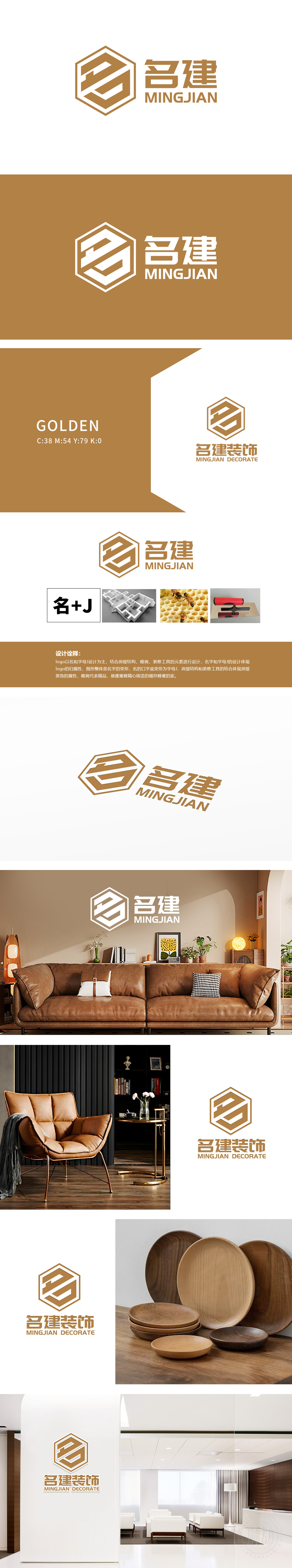
狮动设计以“名”字和字母“J”为核心变形,整体呈六边形轮廓,内部线条交织形成房屋结构的抽象化表达,直观呼应“家居装饰”的行业属性。六边形轮廓借鉴“蜂巢”意象,隐喻家居装饰如同蜜蜂筑巢般“精心打造”,传递“精工细作”“品质居所”的品牌理念。LOGO采用棕金色调,兼具温暖感与质感,既符合家居空间的温馨属性,又体现“名建”品牌的专业与可靠,更贴近家庭用户对“家”的情感需求。整体设计将抽象的品牌诉求转化为具象的视觉语言,并通过行业元素的隐喻,让设计既有记忆点,又有情感共鸣。
Lion design takes the word "name" and the letter "J" as the core deformation, and the overall shape is hexagonal, and the internal lines are intertwined to form an abstract expression of the building structure, which intuitively echoes the industrial attribute of "home decoration". The hexagonal outline draws lessons from the image of "beehive", which means that home decoration is "elaborately built" like a bee's nest, and conveys the brand concept of "meticulous work" and "quality residence". LOGO is in brown and gold tones, which has both warmth and texture. It not only conforms to the warm attributes of home space.


扫码或拨打添加客服微信


