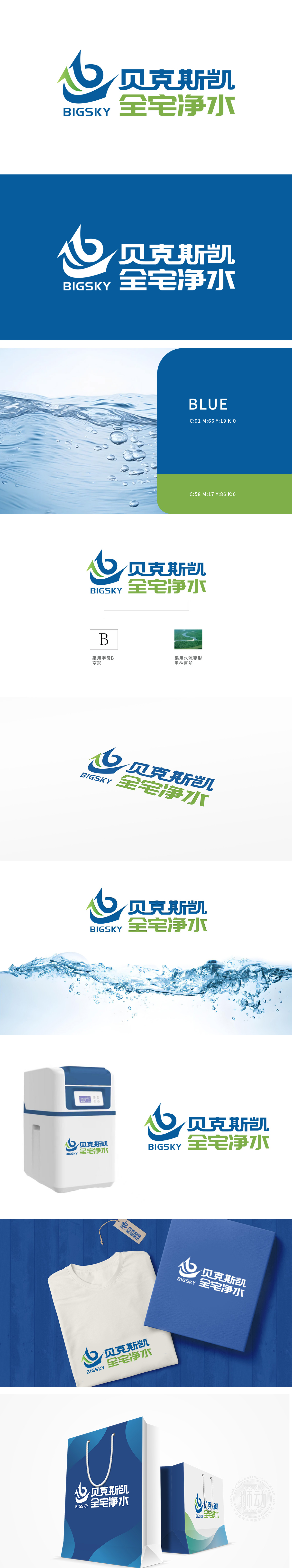
狮动设计以品牌首字母“B”为基础,通过流畅的曲线与箭头元素融合,蓝色主调象征科技、纯净与专业(契合净水行业属性),绿色辅助线条增添自然、健康感,整体呈现“向上跃升”的动态趋势,传递品牌进取精神。狮动的设计通过“字母变形+行业符号+色彩隐喻”的组合,精准平衡了品牌识别、行业属性与情感价值,既体现了对“全宅净水”业务的深刻理解,也以简洁有力的视觉语言塑造了专业、值得信赖的品牌形象。
Lion Design is based on the brand initials "B". Through the integration of smooth curves and arrow elements, the blue theme symbolizes science and technology, purity and professionalism (which is in line with the attributes of water purification industry), and the green auxiliary lines add a sense of nature and health, showing a dynamic trend of "upward leap" as a whole, conveying the enterprising spirit of the brand. Through the combination of "letter distortion+industry symbol+color metaphor", Lion Motion's design accurately balances brand recognition, industry attributes and emotional value.


扫码或拨打添加客服微信


