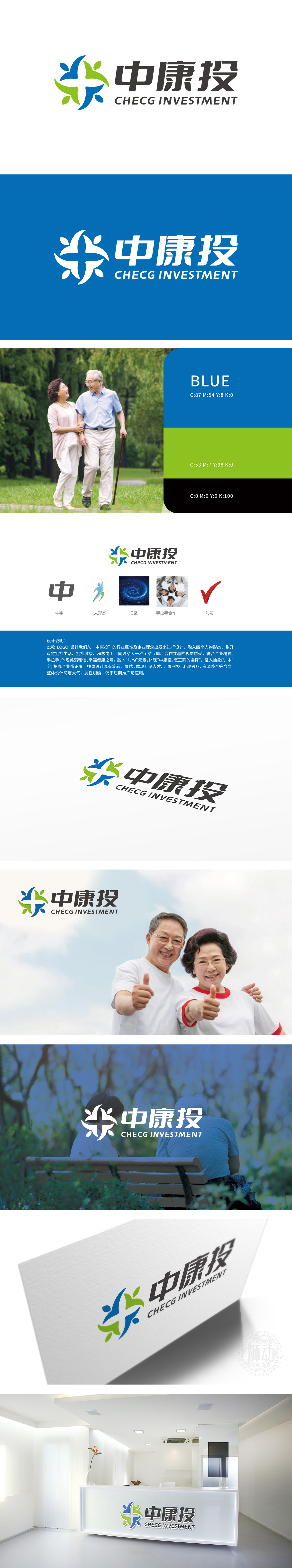
狮动设计融入抽象“中”字,既体现企业名称识别度,也暗含“中国康养”“中正和谐”的理念,符合康养产业强调的“本土化、系统性健康管理”方向。四个抽象“人形”构成,张开双臂的姿态传递出“拥抱生活、拥抱健康”的积极感,与康养行业倡导的“活力、关怀、身心平衡”核心价值高度契合。绿色与蓝色的渐变色彩强化了健康、安全的行业属性。人形围绕中心旋转汇聚的动态感,象征“汇聚人才、科技、医疗资源”,呼应康养行业“整合医疗、养老、健康管理等多领域资源”的发展模式;“手拉手合作”的辅助图形,则强化了“医患协作”“家庭关怀”“社会共担”的康养生态理念。
Lion's design incorporates the abstract Chinese character, which not only reflects the recognition of the enterprise name, but also implies the concept of "China Kangyang" and "Harmony between China and", which conforms to the direction of "localization and systematic health management" emphasized by Kangyang industry. Composed of four abstract "human figures", the gesture of opening arms conveys the positive feeling of "embracing life and health", which is highly consistent with the core values of "vitality, care and physical and mental balance" advocated by the health care industry. The gradient colors of green and blue strengthen the healthy and safe industry attributes. The dynamic sense of human form rotating around the center symbolizes "gathering talents.
、


扫码或拨打添加客服微信


