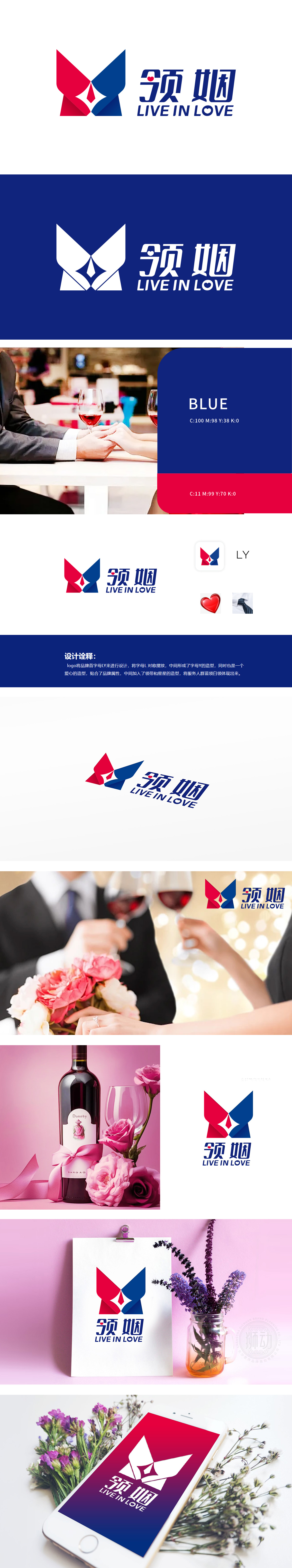
狮动设计以品牌首字母“LY”为设计基础,字母“L”对称摆放形成“Y”,同时整体构成爱心轮廓,爱心是婚恋情感的经典符号,直接呼应相亲场景中对“爱”与“情感连接”的核心诉求。红色象征热情、浪漫,蓝色代表理性、可靠,冷暖色搭配既体现情感温度,中间的领带和星星元素:领带象征商务、正式,星星则寓意“缘分”“闪耀的相遇”,强化品牌对特定人群的精准服务定位。LOGO整体采用对称结构,红蓝配色沉稳且富有活力,字母与图形的融合设计既体现创意,又不失正式感,暗示品牌在相亲服务中的专业性,帮助用户建立对平台的信任感。
Lion design is based on the brand initials "LY", and the letters "L" are symmetrically placed to form "Y", and at the same time, it constitutes the outline of love as a whole. Love is a classic symbol of love and marriage, which directly echoes the core demands of "love" and "emotional connection" in the blind date scene. Red symbolizes enthusiasm and romance, and blue represents rationality and reliability. The collocation of cold and warm colors not only reflects the emotional temperature, but also the tie and star elements in the middle: the tie symbolizes business and formality. The overall LOGO adopts a symmetrical structure, and the red and blue colors are calm and energetic.


扫码或拨打添加客服微信


