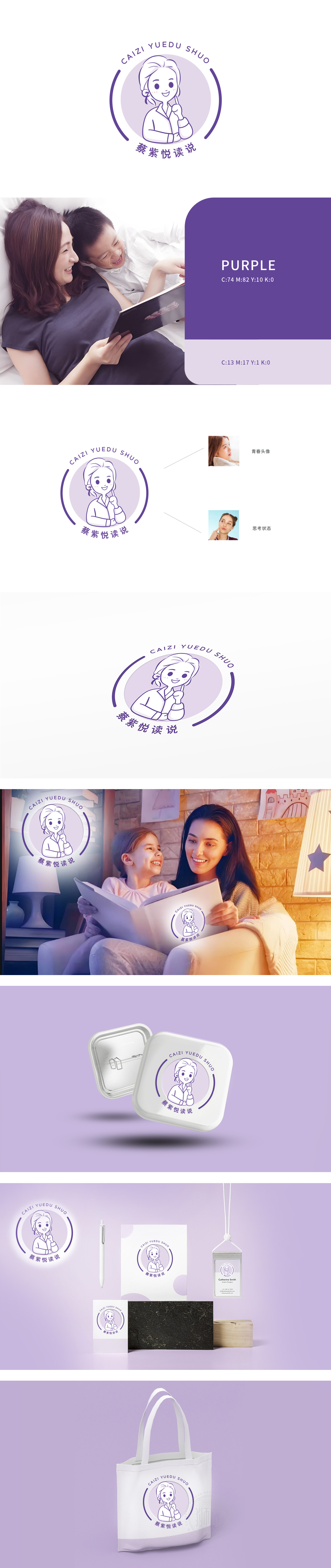
狮动设计以一位面带微笑、单手托腮的女性形象,线条圆润柔和,表情亲切自然,传递出“悦读”相关的温暖、知性气质,人物发型简约(发髻+碎发),穿着衬衫,兼具正式感与亲和力,符合“分享者”“引导者”的身份定位;托腮动作呼应右侧“思考状态”的参考图,强化“阅读-思考”的品牌内核,视觉符号与品牌功能高度统一。整体色调柔和、清新,又符合“悦读”的轻松氛围,同时紫色易引发“优雅”“创造力”的联想,贴合女性向或泛文化类受众。以“人物IP”突破传统知识品牌设计范式,建立差异化;商业落地思维:兼顾美学、记忆点与实用性,用一个“超级符号”占领用户心智。
Lion Design takes the image of a woman with a smile and one hand holding her chin. Her lines are round and soft, and her expression is kind and natural, which conveys the warmth and intellectual temperament related to "reading". Her hairstyle is simple (bun+broken hair), and she wears a shirt, which has both a sense of formality and affinity, and conforms to the identity of "sharer" and "guide". The chin-holding action echoes the reference picture of "thinking state" on the right, strengthens the brand core of "reading-thinking", and the visual symbols and brand functions are highly unified.The overall tone is soft and fresh, which is in line with the relaxed atmosphere of "reading".


扫码或拨打添加客服微信


