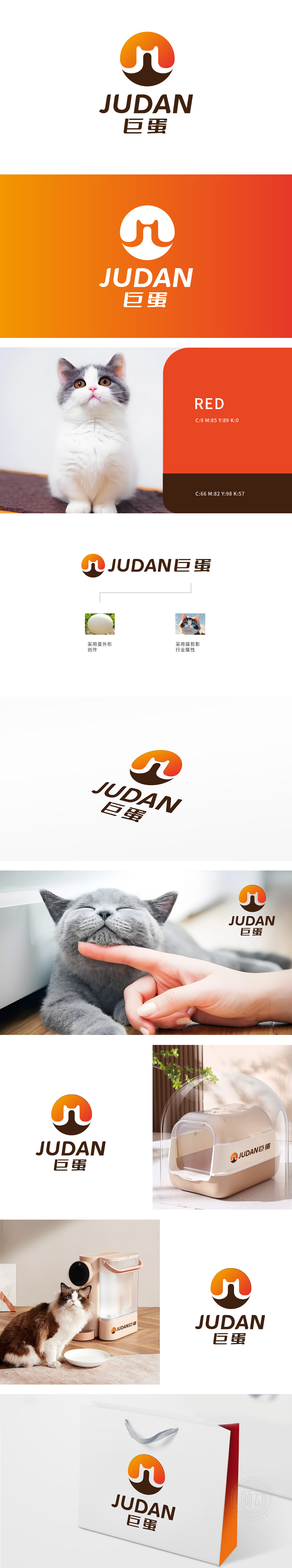
狮动设计以橙色至深棕渐变的蛋形轮廓为主体,内部巧妙融入了抽象的猫科动物头部剪影:剪影线条简洁流畅,通过左右对称的“耳朵”和下方内凹的“面部轮廓”,直观呈现出猫的形态特征,既保留了宠物的亲和力,又与“蛋”的外形形成创意结合,蛋代表生命、营养、孕育,暗示产品富含天然营养、助力宠物健康成长;传递出“圆润、呵护、温暖”的品牌联想。整体将“猫”与“蛋”组合,形成独特的品牌符号,既突出宠物属性,又通过生活化的“蛋”元素降低距离感,增强logo的趣味性和记忆度,符合新客户对“狮动设计能力”的认可。
Lion design takes the egg-shaped outline with gradual change from orange to dark brown as the main body, and ingeniously incorporates the abstract silhouette of the cat's head: the silhouette lines are simple and smooth. Through the symmetrical "ears" and the concave "facial outline" below, the cat's morphological characteristics are intuitively presented, which not only retains the pet's affinity, but also forms a creative combination with the shape of "egg", which represents life, nutrition and gestation, suggesting that the product is rich in natural nutrition and helps pets. Convey the brand association of "roundness, care and warmth". The overall combination of "cat" and "egg" forms a unique brand symbol


扫码或拨打添加客服微信


