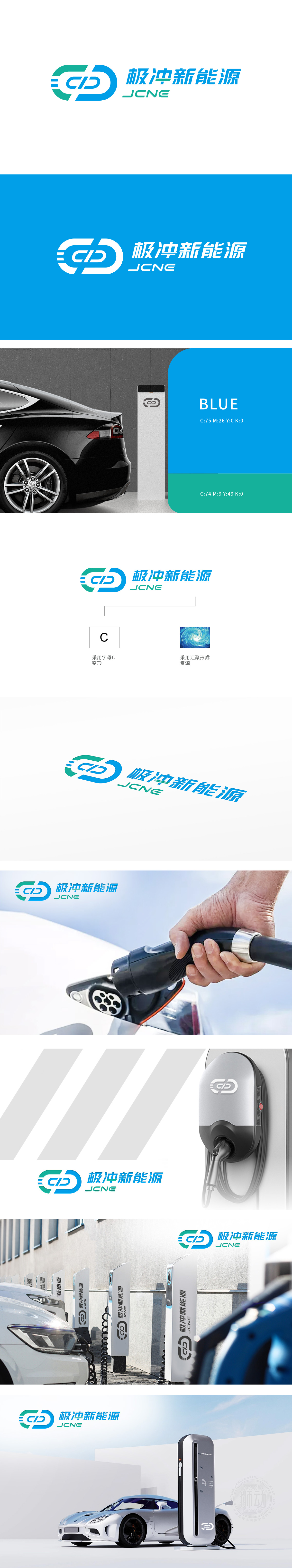
狮动设计以字母“C”为基础,通过流畅的蓝绿色渐变线条形成闭环结构,象征新能源领域的“循环经济”与“可持续发展”理念。闭环线条中的切割与连接处理,形似能量流动轨迹,传递“极冲”所蕴含的高效、动态的能源转化特性。主色调采用科技蓝与生态绿的渐变,蓝色象征科技、专业与可靠性,绿色代表环保、可持续,。通过“循环线条+汇流意象+蓝绿配色”,将新能源的“可持续、清洁、高效”核心价值视觉化,设计语言与行业属性高度贴合,让受众快速建立品牌认知。设计既具现代科技感,又蕴含行业深层价值。
Lion design is based on the letter "C" and forms a closed-loop structure through smooth blue-green gradient lines, symbolizing the concepts of "circular economy" and "sustainable development" in the new energy field. The cutting and connecting process in the closed-loop line is similar to the energy flow trajectory, which conveys the efficient and dynamic energy conversion characteristics contained in the "extreme impact". The main color adopts the gradient of technology blue and ecological green, blue symbolizes technology, professionalism and reliability, and green represents environmental protection and sustainability. Through "circular lines+confluence image+blue-green color matching", the core values of "sustainability.


扫码或拨打添加客服微信


