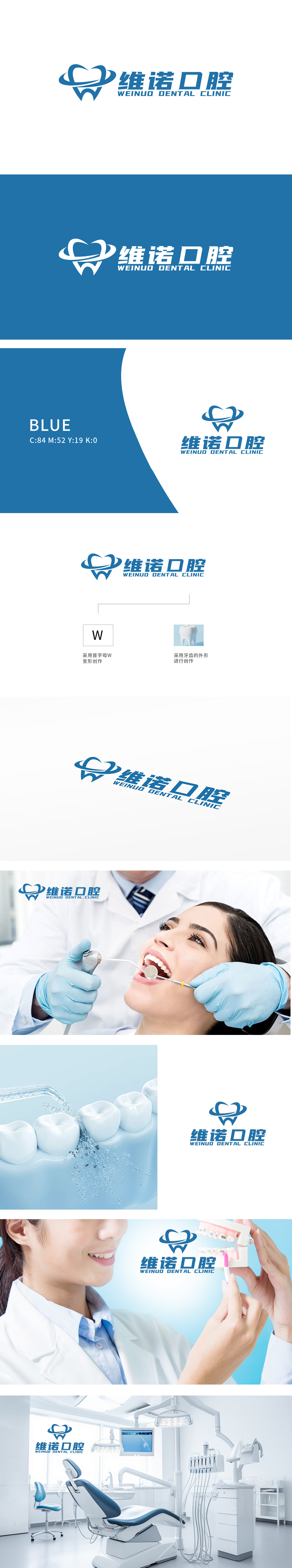
狮动设计采用首字母W变形创作”,字母“W”经艺术化处理,融入牙齿轮廓的弧度特征,形成品牌专属记忆符号,强化“维诺WEINUO)”的名称识别。抽象化的牙齿轮廓为核心,牙齿线条圆润饱满,既直观体现口腔行业属性,又传递健康、专业的品牌联想;整体设计从品牌名称与行业特性(“口腔”)出发,通过符号化提炼(W字母变形)、具象元素抽象化(牙齿造型艺术处理)、色彩心理学应用(蓝色+白色)三大核心策略,实现了“行业辨识度”“品牌独特性”与“情感信任感”的三重统一。
Lion design adopts the first letter W, and the letter W is artistically treated and integrated into the radian characteristics of tooth contour to form a brand-specific memory symbol, which strengthens the name recognition of "WEINUO Weinuo". The abstract tooth outline is the core, and the tooth lines are round and full, which not only directly reflects the attributes of the dental industry, but also conveys healthy and professional brand association; global design Starting from brand name ("Vino") and industry characteristics ("oral cavity"), the triple unification of "industry recognition".


扫码或拨打添加客服微信


