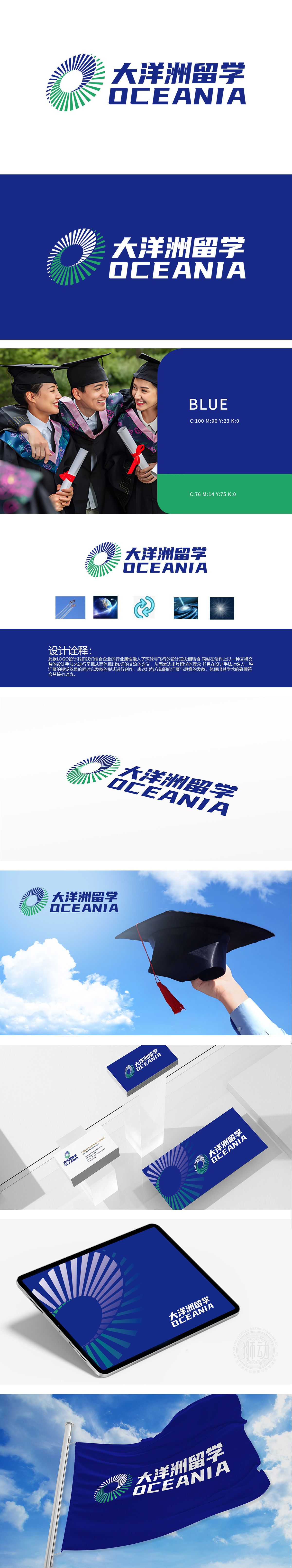
狮动设计通过螺旋上升的蓝绿色环形,内圈留白形成“O”字轮廓,象征地球、全球化视野及知识的循环流动,进一步强化留学主题的核心关键词:跨越、全球、交流、探索、成长。交换交替的设计手法”体现在环形的循环结构与双向箭头图形上,寓意不同文化、知识体系的交融;“汇聚与发散”的视觉效果则象征多元知识的整合与个人思维的拓展,契合留学“学术碰撞”的深层价值。通过“全球化符号+知识流动意象+专业色彩体系”的组合,精准捕捉了留学教育的核心诉求,既满足品牌识别的功能性,又传递出“开放、交流、成长”的情感价值。
Lion design is a spiral blue-green ring, and the inner ring is left blank to form an "O" outline, which symbolizes the earth, the global vision and the circular flow of knowledge, and further strengthens the core keywords of the theme of studying abroad: leap, globalization, communication, exploration and growth. The design technique of exchange and alternation is embodied in the circular structure and two-way arrow graphics, which means the blending of different cultures and knowledge systems; The visual effect of "convergence and divergence" symbolizes the integration of multiple knowledge and the expansion of personal thinking, which is in line with the deep value of "academic collision" in studying abroad.


扫码或拨打添加客服微信


