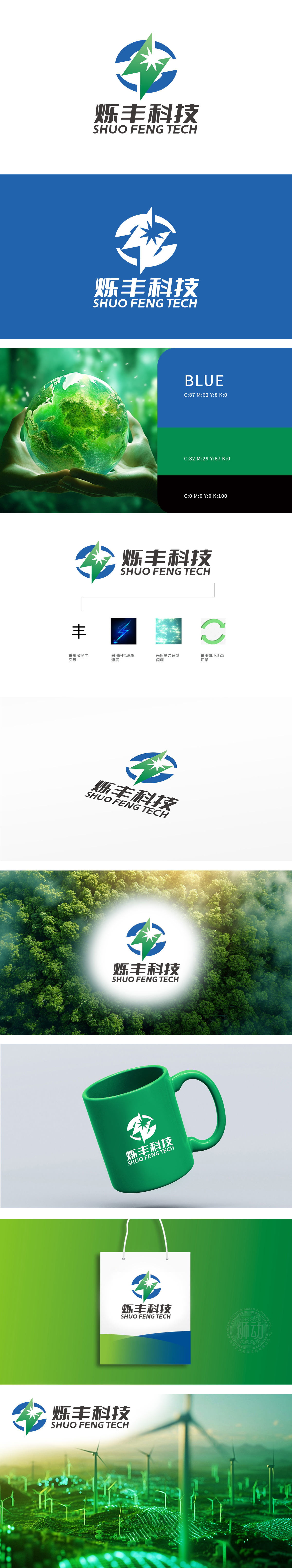
狮动设计采用闭环循环形态,象征“汇聚”“可持续”“科技闭环”,线条流畅且具有包容感,传递企业合作共赢与系统性思维。绿色三角形似抽象化的“丰”字变形,棱角分明,传递“丰收、稳健、突破”的意象;中心白色星形搭配放射状线条,结合“星光造型·闪耀”元素,强化科技感与品牌光芒,同时星形尖锐的笔触与闪电造型,形成视觉关联,暗喻“速度与创新”。通过“循环+星光+速度+汉字”的复合设计语言,精准传递了烁丰科技“科技引领、绿色高效、丰硕成长”的品牌定位,同时巧妙兼顾化工行业的潜在属性。
Lion design adopts closed-loop circulation form, symbolizing "convergence", "sustainability" and "closed-loop technology", with smooth lines and a sense of tolerance, conveying win-win cooperation and systematic thinking of enterprises. The green triangle is distorted like the abstract word "Feng", with sharp edges and corners, conveying the image of "bumper harvest, stability and breakthrough"; The white star in the center is matched with radial lines, combined with the element of "starlight modeling and shining", which strengthens the sense of science and technology and brand light. At the same time, the sharp strokes of the star and lightning modeling form a visual connection, which is a metaphor for "speed and innovation".


扫码或拨打添加客服微信


