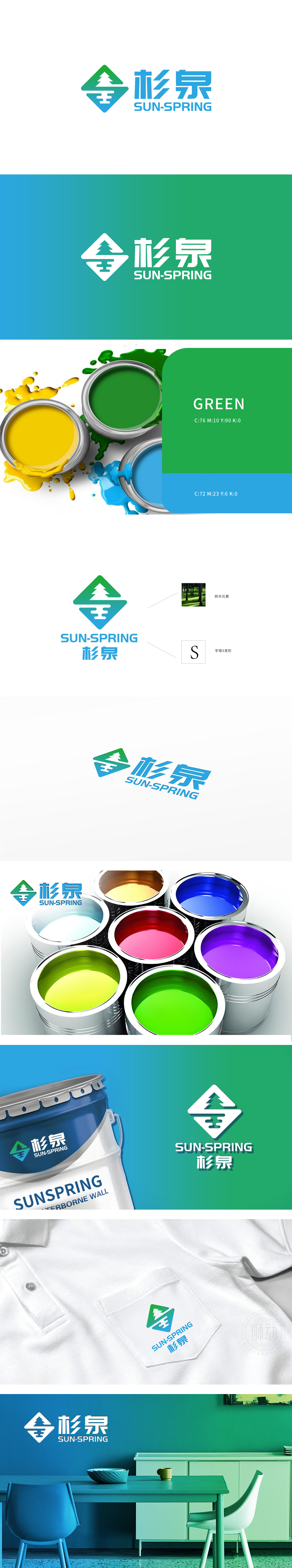
狮动设计采用流畅的“S”形(品牌英文名首字母),既呼应“杉泉”拼音首字母“SHAN”,又通过水流般的曲线传递“泉”的流动性,“杉”指向树木(木材、自然),“泉”关联水源(纯净、流动),传递建材油漆的天然、环保属性;深绿到中部浅绿再到底部湖蓝,绿色象征自然、健康,蓝色象征纯净、科技技术实力,整体色调清新柔和,菱形作为稳定的几何图形,传递品牌“可靠、专业”的形象,适合建材行业对质量感的需求;而“S”形曲线的灵动性,则中和了工业感,赋予品牌亲和力。
Lion design adopts a smooth "S" shape (the English initials of the brand), which not only echoes the pinyin initials "SHAN" of "Shan Quan", but also conveys the fluidity of "Quan" through the curve like water flow, where "Shan" points to trees (wood, nature) and "Quan" is associated with water sources (purity and fluidity), conveying the natural and environmental protection properties of building materials paint; Dark green to light green in the middle and then to lake blue at the bottom, green symbolizes nature and health, blue symbolizes purity and technological strength, and the overall tone is fresh and soft.


扫码或拨打添加客服微信


