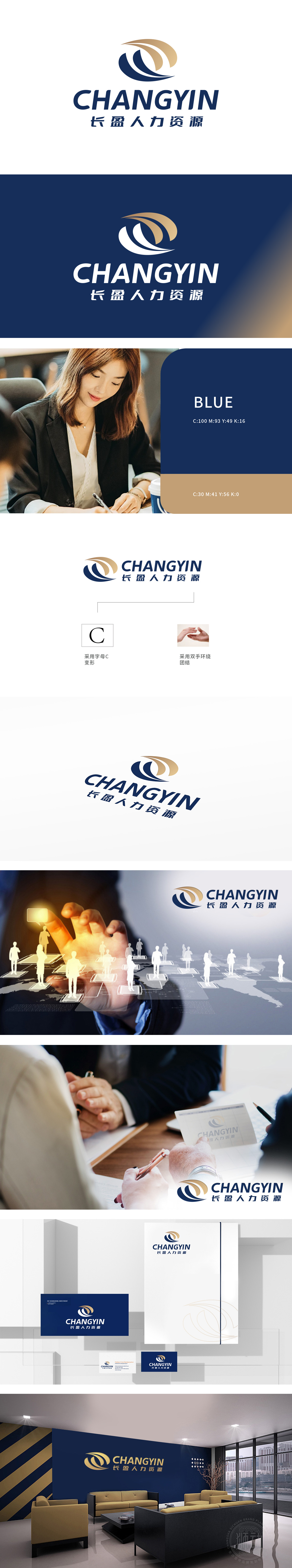
狮动受长盈公司委托设计品牌logo,以“专业、协作、信赖”为核心理念,打造视觉符号。logo采用双弧交织设计,深蓝与金色碰撞,既象征人力资源的智慧联结,又传递稳健与创新并存的行业特质。字体简洁大气,强化品牌辨识度。设计从行业洞察出发,将抽象理念具象化,最终方案获客户高度认可,有效提升品牌形象与市场竞争力。
Lion Motion was commissioned by Changying Company to design the brand logo, with the core concept of professionalism, cooperation and trust" to create visual symbols. Logo adopts double-arc interwoven design, and the collision between dark blue and gold not only symbolizes the wisdom connection of human resources, but also conveys the industry characteristics of both stability and innovation. The font is concise and atmospheric, which strengthens brand recognition. Based on the insight of the industry, the design concretizes the abstract concept, and the final scheme is highly recognized by customers, effectively enhancing the brand image and market competitiveness.


扫码或拨打添加客服微信


