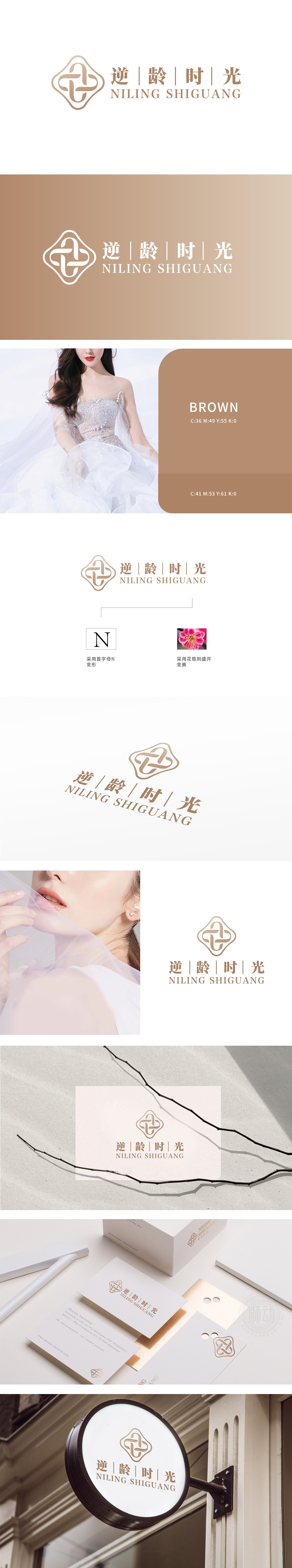
狮动设计采用首字母“N”变形的图案,如花瓣从花苞到盛开,与“逆龄时光”的品牌名称内涵相呼应。在日化美容领域,花朵常常象征着美丽、绽放和生命力。从花苞到盛开的过程,寓意着使用该品牌的日化美容产品,消费者能够如同花朵一样,(实现“逆龄”(即时光倒流般的美丽蜕变)的效果,“逆龄时光”这几个汉字,字体风格优雅端庄,宛如一位身着华服的优雅仕女,静静诉说着对时光与美丽的独特见解,传递出满满的品质感,标识整体设计宛如一位无声却有力的“品牌使者”,将“逆龄”(与时光对抗,留住美丽青春)和“时光”(在时间长河中实现肌肤等的美好改变)的理念,通过视觉符号精准传递给消费者,营造出高端、优雅且专业的品牌形象。
Lion design adopts the pattern with the initial "n" deformation, such as petals from bud to full bloom, which echoes the brand name connotation of "anti-age time". In the field of daily cosmetic, flowers often symbolize beauty, blooming and vitality. The process from bud to full bloom means that consumers can, like flowers, achieve the effect of "anti-age" (that is, the beautiful transformation like going back in time). The font style of these Chinese characters "anti-age time" is elegant and dignified, just like an elegant lady dressed in fine clothes, quietly telling her unique views on time and beauty, conveying a full sense of quality, and marking the overall design as a silent but powerful one.


扫码或拨打添加客服微信


