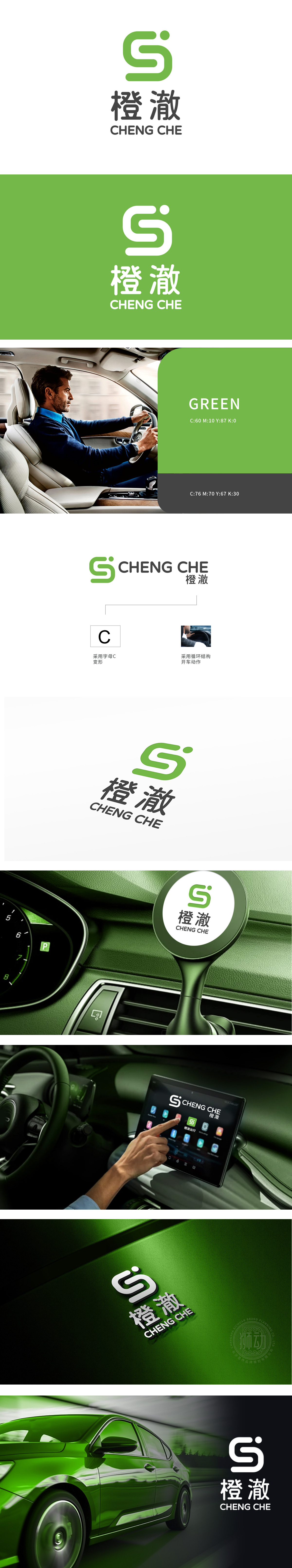
狮动设计基于字母“C”变形,宛如灵动的出行召唤符。其字型特点与网约车紧密相连——字母“C”仿佛是车辆启动时的那抹活力之绿,代表着品牌开端;字母“C”变形循环结构仿如开车动作元素,恰似网约车在城市道路上持续、顺畅行驶的轨迹,完美传达出网约车服务的核心——驾驶行为的连贯性与流畅性。整个标志设计简洁而富有深意,每一处细节都在诉说着与网约车的渊源,视觉吸引力与品牌辨识度兼具。
Lion design is based on the deformation of the letter "C", just like a smart travel summoner. Its font characteristics are closely connected with the network car-the letter "C" seems to be the vibrant green when the vehicle starts, representing the beginning of the brand; The letter "C" is like a driving action element, just like the continuous and smooth running track of the network car on the urban road, which perfectly conveys the core of the network car service-the coherence and fluency of driving behavior.


扫码或拨打添加客服微信


