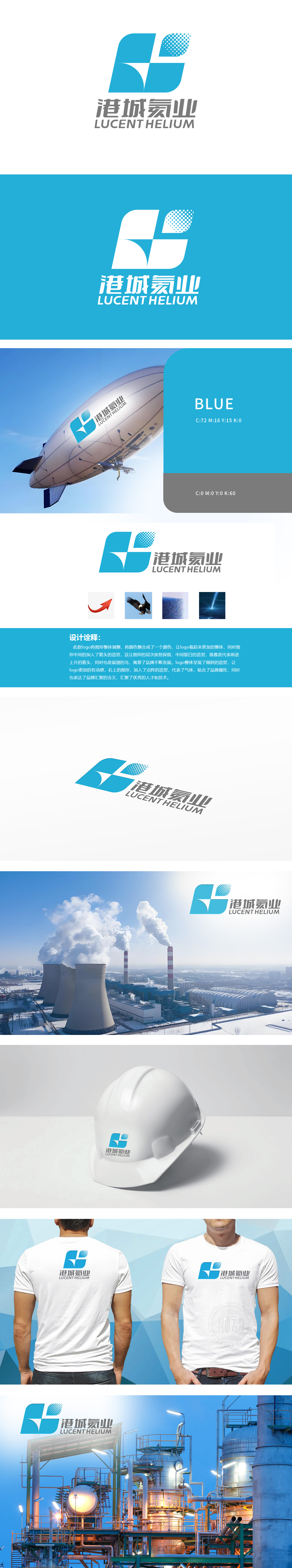
狮动设计融入箭头造型,传达出化工技术不断迭代升级,如同箭头上升前进;而展翅飞鸟,寓意企业在化工领域如行业“领头鸟”,引领技术或产品方向。意象传达开拓精神。整体倾斜造型,代表市场拓展等方面的冲劲,与传统静态化工品牌标志形成鲜明对比,增强记忆点。点阵图形,精准贴合“氦气”(气体)的品牌属性。汇聚形态,引申为企业汇聚行业优质资源,打造自身竞争优势。用设计为化工企业注入灵动的品牌“魂”与务实的行业“劲”。
Lion design is integrated with arrow modeling, conveying that chemical technology is constantly iteratively upgraded, just like an arrow rising forward; The flying birds mean that enterprises are "leading birds" in the chemical industry, leading the direction of technology or products. Images convey pioneering spirit. The overall inclined shape represents the momentum of market expansion, which is in sharp contrast with the traditional static chemical brand logo and enhances the memory point. Dot matrix graphics accurately fit the brand attribute of "helium" (gas).


扫码或拨打添加客服微信


