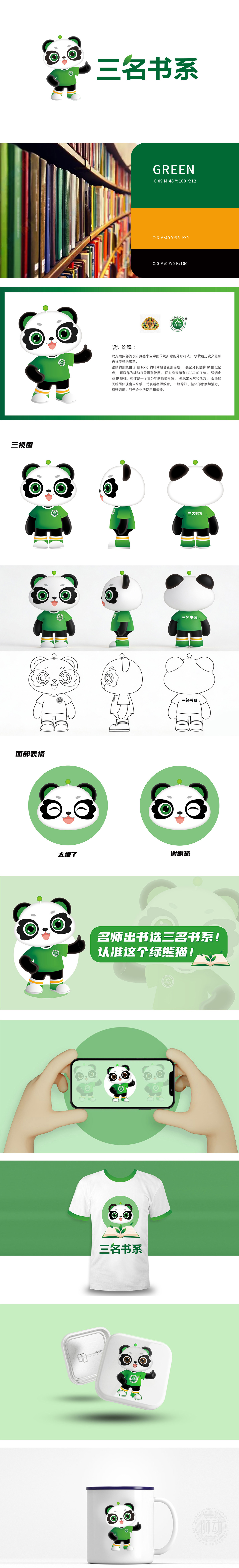
设计诠释:
此方案头部的设计灵感来自中国传统如意的外形样式,承载着历史文化和吉祥美好的寓意。眼睛的形象由3和logo的叶片融合变形而成,是区分其他的IP的记忆点,可以作为辅助符号提取使用,同时身穿印有LOGO的T恤,强调企业IP属性。整体是一个青少年的熊猫形象,体现出元气和活力,头顶的天线而体现出未来感,代表着名师教育,一路绿灯。整体形象亲切活力,有辨识度,利于企业的使用和传播。
The LOGO designed by Lion Motion for the "Three Books Department" skillfully combines the panda image with the page elements, and carries the knowledge attribute with childlike IP. Panda's sleek shape conveys intimacy, and the green ball on the top of the head forms a visual linkage with the green leaves on the page, symbolizing the growth of wisdom. The font design is concise and powerful, which is integrated with the illustration style. The scheme accurately fits theositioning of educational brands, and the green main color is fresh and atural, which is very memorable as a whole, effectively improving brand recognition and customer goodwill.


扫码或拨打添加客服微信


