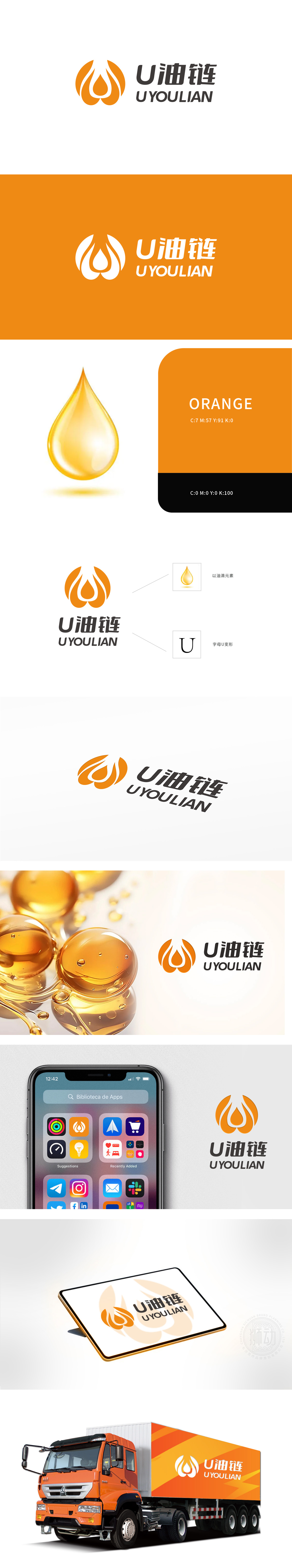
狮动设计以主体图形,形似火焰,又如同三滴汇聚的油滴。火焰在化工石油领域,常象征着能量、动力与激情,代表着化工石油产业为工业发展、能源供应等提供源源不断的动力源泉。而油滴的形态则直接关联到石油这一核心元素,行业辨识度高,线条与色彩:线条简洁流畅,勾勒出图形的轮廓,给人一种现代感与科技感。橙色的运用十分精妙,橙色是暖色调,在化工石油行业中,它可以传达出活力、温暖和积极的企业形象。整体设计通过巧妙的图形(火焰/油滴)与文字(“U油链”及英文)组合,在图形分析上完美契合化工石油行业属性,展现出独特的设计魅力。其创新性、简洁性、行业契合性以及强大的延展性等优势。
Lion design takes the main figure, which looks like a flame, and is like three droplets of oil. In the field of chemical petroleum, flame often symbolizes energy, motivation and passion, and represents the chemical petroleum industry to provide a continuous source of power for industrial development and energy supply. The shape of oil droplets is directly related to the core element of oil, with high industry recognition, simple and smooth lines and colors, which outline the outline of graphics and give people a sense of modernity and technology. The use of orange is very subtle. Orange is a warm color. In the chemical and petroleum industry, it can convey a vibrant, warm and positive corporate image.
、


扫码或拨打添加客服微信


