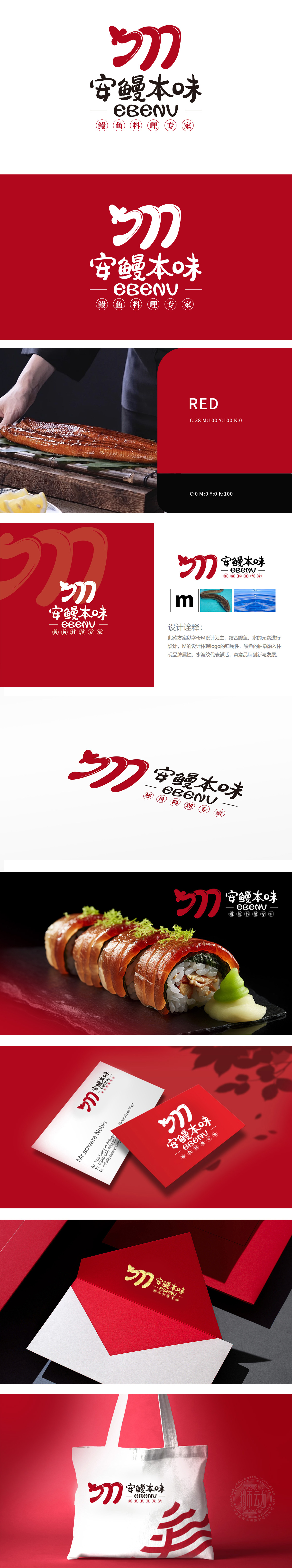
狮动设计以品牌名称首字母「M」为视觉主体,通过线条的流畅变形,既保留字母辨识度,又赋予动态感,暗合餐饮品牌的活力属性。「M」线条模拟鳗鱼游动时的弯曲弧度,用极简图形传递“鳗鱼料理专家”的核心定位,通过「M+鳗鱼」的符号组合,让消费者在3秒内快速关联“鳗鱼料理”品类,降低认知成本;红色与动态线条传递“热情、新鲜、地道”的品牌基因,与「安鳗本味」的“安心食材、本真味道”定位深度契合,实现视觉与理念的统一。
Lion design takes the initial letter "M" of the brand name as the visual subject, and through the smooth deformation of lines, it not only retains the letter recognition, but also gives a sense of dynamic, which coincides with the dynamic attribute of the catering brand. The "M" line simulates the bending radian of eel swimming, conveys the core positioning of "eel cooking expert" with minimalist graphics, and allows consumers to quickly associate the "eel cooking" category within 3 seconds through the symbol combination , thus reducing the cognitive cost; Red and dynamic lines convey the brand gene of "enthusiasm, freshness and authenticity".


扫码或拨打添加客服微信


