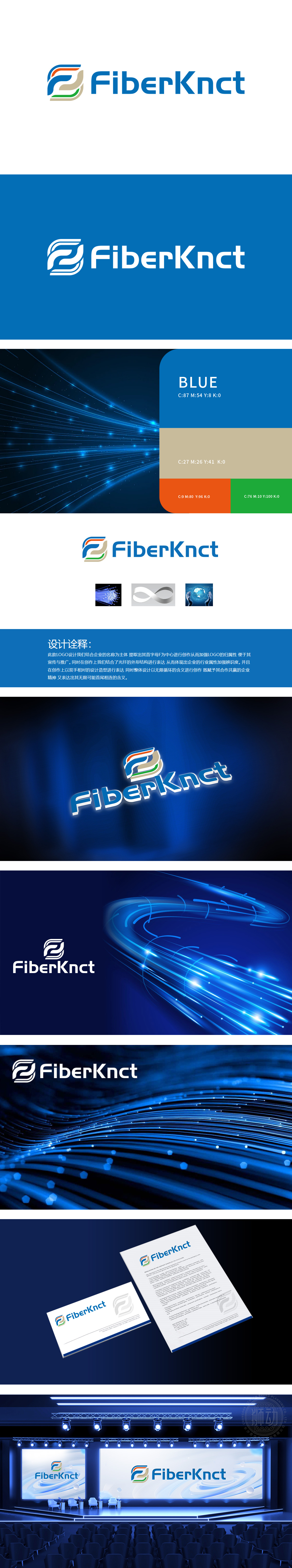
狮动设计采用 蓝色渐变与动感笔触,既保留“F”的识别性,又通过卷曲、缠绕的形态模拟 光纤线缆的物理结构,直观体现企业在光纤通信领域的核心业务,线条末端的绿色、橙色点缀,象征数据传输的“信号源”与“连接活力”,强化科技感与行业辨识度。通过 “字母符号化+行业元素隐喻+精神价值升华” 的三重设计逻辑,将“光纤通信”的技术特性、“无限连接”的行业使命与“合作共赢”的企业精神融为一体,既具备高度的行业辨识度,又传递出品牌的独特价值观。
Lion design adopts blue gradient and dynamic brushwork, which not only retains the identification of "F", but also simulates the physical structure of optical fiber cable through the curled and wound form, which directly reflects the core business of enterprises in the field of optical fiber communication. The green and orange decorations at the ends of lines symbolize the "signal source" and "connection vitality" of data transmission, and strengthen the sense of science and technology and industry recognition. Through the triple design logic of "letter symbolization+industry element metaphor+spiritual value sublimation".


扫码或拨打添加客服微信


