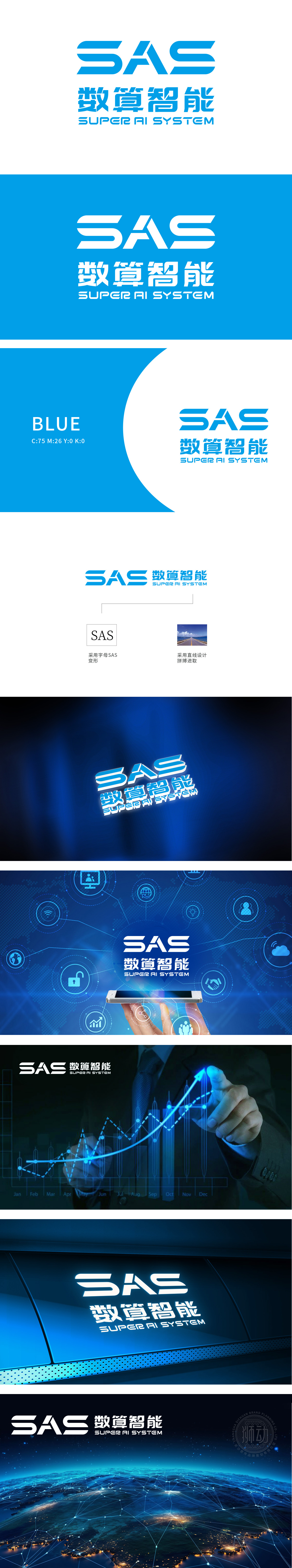
狮动设计将大写字母“SAS”为原型进行艺术化变形,三个字母通过流畅的线条连接,形成连贯的视觉整体。字体采用蓝色渐变,线条简洁锐利,既保留了字母的识别性,又通过弧度与直线的结合传递科技感与动态感,呼应“数算智能”的AI技术属性,直线与曲线、蓝色调的选择,既传递科技属性,又融入品牌精神,实现“美观”与“意义”的统一;logo通过简洁而富有深意的设计,成功塑造了“数算智能”专业、进取、科技驱动的品牌形象。
Lion Design takes the capital letter "SAS" as the prototype for artistic deformation, and the three letters are connected by smooth lines to form a coherent visual whole. The font adopts blue gradient, and the lines are concise and sharp, which not only retains the identifiability of letters, but also conveys the sense of science and technology and dynamics through the combination of radian and straight line, echoing the AI technical attribute of "arithmetic intelligence", and the choice of straight line and curve and blue tone not only conveys the scientific and technological attribute, but also integrates the brand spirit to realize the unity of "beauty" and "meaning".


扫码或拨打添加客服微信


