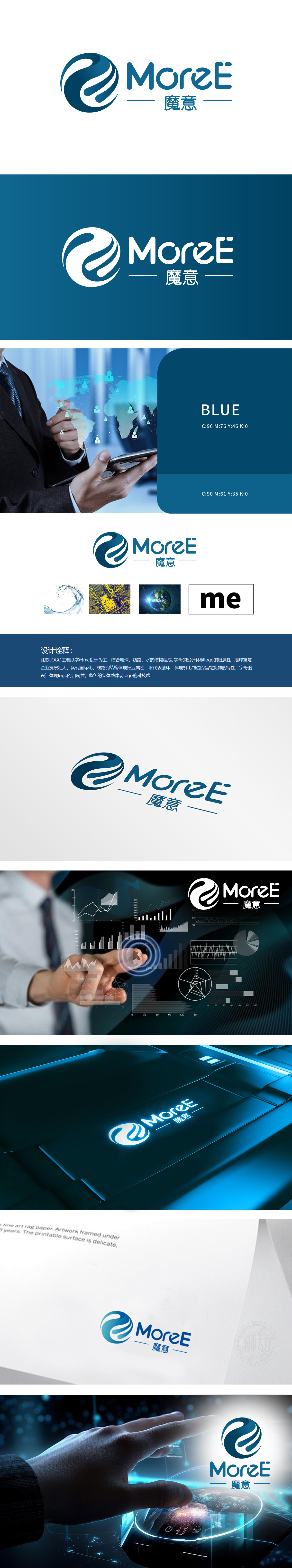
狮动设计字母“m”和“e”为骨架,通过流畅的曲线交织形成动态闭环,既直接呼应品牌名称“魔意,又强化了品牌归属的专属感。水波纹(螺旋线条模拟水流的流动性,象征“循环”与“持续运转”,地球,寓意企业“全球化发展”的愿景,增强品牌的国际视野与格局。整体以“me”为核心的抽象图形简洁易记,流动的线条打破传统科技LOGO的生硬感,兼具理性与灵动,既体现专业性,又不失创意巧思。
Lion design letters "M" and "E" are used as the skeleton, and a dynamic closed loop is formed by interweaving smooth curves, which not only directly echoes the magic meaning of the brand name, but also strengthens the exclusive sense of brand ownership. Water ripple (spiral line simulates the fluidity of water flow, symbolizes "circulation" and "continuous operation", symbolizes the vision of "global development" of enterprises, and enhances the international vision and pattern of brands. The abstract graphics with "me" as the core are simple and easy to remember.


扫码或拨打添加客服微信


