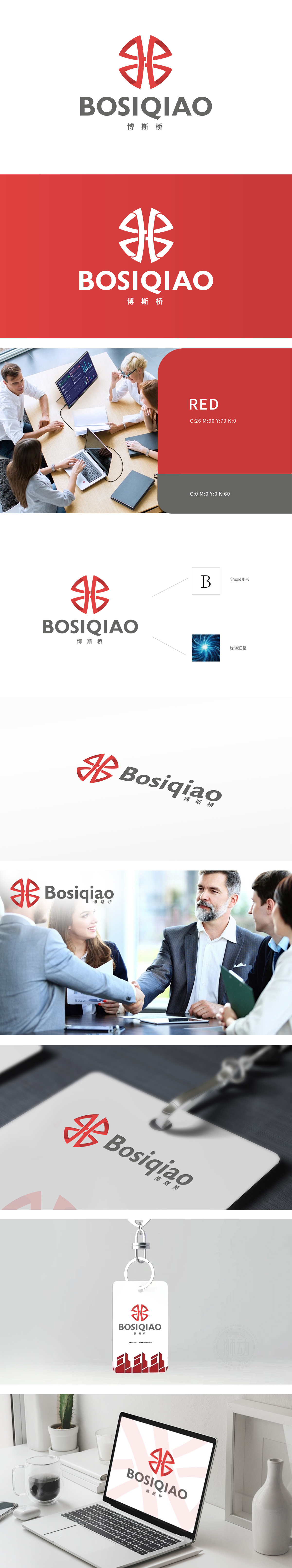
狮动设计以对称切割+旋转嵌套,将其转化为“双向连接的桥梁结构”:左半部分象征“企业/资源”,右半部分象征“客户/市场”,中间的交叉节点则代表“价值交换的核心枢纽”。这种设计暗合“博斯桥”作为“连接者”的品牌定位——如同漩涡中心的引力,象征企业在行业中汇聚资源、链接价值的核心能力。红色传递活力、信任与专业,而蓝色漩涡则补充科技感与深度,色彩对比既增强视觉张力,又暗示品牌“热情服务”与“理性专业”的双重特质。整体设计:用动态感强化商业信心,选择博斯桥,你将成为资源汇聚的中心。
Lion design is transformed into a "two-way connected bridge structure" by symmetrical cutting and rotating nesting: the left half symbolizes "enterprise/resource", the right half symbolizes "customer/market", and the intersection node in the middle represents "the core hub of value exchange". This design coincides with the brand positioning of "Bos Bridge" as a "connector"-just like the gravity of the vortex center, symbolizing the core ability of enterprises to gather resources and link value in the industry. Red conveys vitality, trust and professionalism, while blue whirlpool supplements the sense of science and technology and depth. Color contrast not only enhances visual tension, but also implies the dual characteristics of brand "warm service".


扫码或拨打添加客服微信


