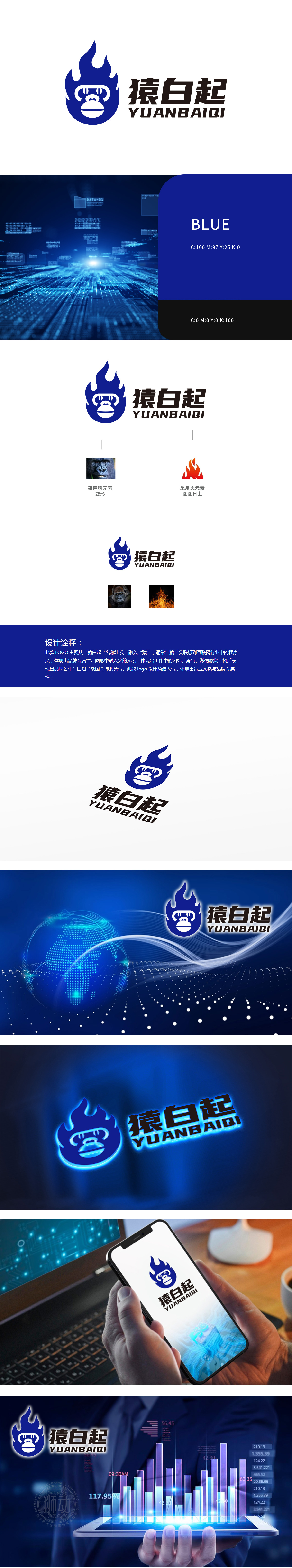
狮动设计以抽象化的“猿脸”为核心视觉符号,线条简练却保留了猿类面部特征,既呼应品牌名称中的“猿”,又巧妙关联IT行业中“程序员”的职业标签,猿脸被包裹在圆形轮廓中,圆形在科技领域常象征“闭环”“系统”“全球化连接”,暗喻品牌在技术研发中的完整性与系统性思维。火焰元素的科技化转译:突破传统,强化数字感,如同代码指令的快速执行、数据能量的迸发,整体通过“猿”的行业符号、“火焰”的数字化转译、“蓝白”的科技色彩体系,以及“历史勇气→科技攻坚”的精神升华,实现了“品牌名称-行业属性-精神内核”的三重统一。
Lion Motion design takes the abstract ape face as the core visual symbol, but the lines are concise but retain the features of ape face, which not only echoes the ape in the brand name, but also skillfully relates to the professional label of "programmer" in the IT industry. The ape face is wrapped in a circular outline, and the circle often symbolizes "closed loop", "system" and "global connection" in the field of science and technology, which implies the integrity and systematic thinking of the brand in technology research and development. Scientific translation of flame elements: breaking through the tradition and strengthening the sense of numbers.


扫码或拨打添加客服微信


