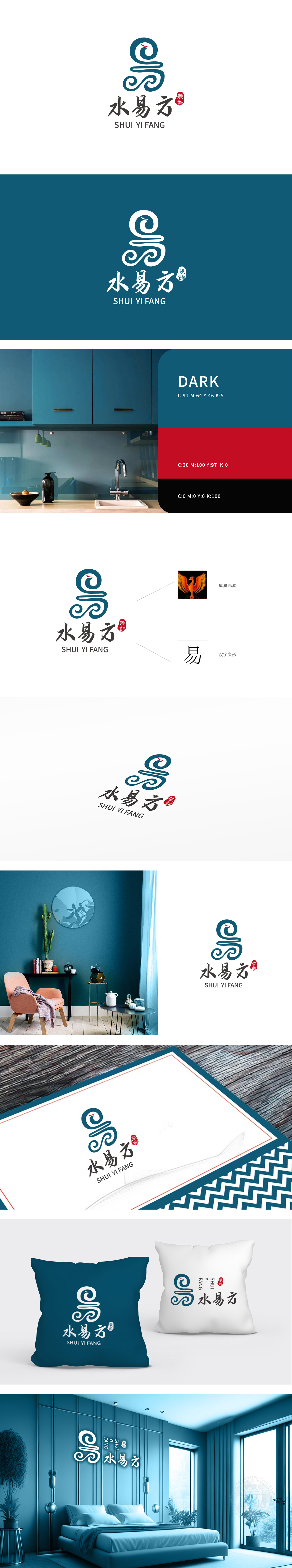
狮动设计巧妙融合了汉字“易”的篆书写法特征(上为“日”、下为“月”的变形),既保留了文字的识别性,又通过曲线的流动感打破静态,赋予“易”字“变化、灵动”的视觉联想。图形线条柔中带刚,既模拟了凤凰羽翼舒展的飘逸感寓意“吉祥、高贵、重生”,与家居装饰行业追求的“品质生活、空间焕新”理念高度契合,传递出品牌对“美学升级”的追求。采用蓝绿色调,兼具“水的灵动”与“自然的生机”,契合“水易方”中“水”的偏旁意象,同时蓝绿色系给人“专业、清新、环保”的感受,符合现代家居对健康空间的追求,整体通过凤凰、“易”字等文化符号的融入,品牌不仅传达“装饰”的功能性,更强调“赋予空间文化内涵与情感温度”。
Lion design skillfully combines the writing characteristics of the Chinese character "Yi" (the upper part is "day" and the lower part is "moon"), which not only retains the recognition of the characters, but also breaks the static state through the flowing feeling of the curve, giving the word "Yi" a visual association of "change and agility". The graphic lines are soft and firm, which not only simulates the elegant feeling of Phoenix wings stretching, but also means "auspiciousness, nobility and rebirth", which is highly compatible with the concept of "quality life and space rejuvenation" pursued by the home decoration industry, and conveys the brand's pursuit of "aesthetic upgrading".


扫码或拨打添加客服微信


